CoronaDash app use case - Clustering countries' COVID-19 active cases trajectories
COVID-19 disease spread hit the World really globally and also the field of mathematicians/ statisticians/ machine learning researchers and related. These experts want to help to understand for example future trends (forecast) of the coronavirus spread. My motivation, in this case, was to create interactive dashboard about COVID-19 to inform about various scenarios in every country and compare them through data mining methods.
I created CoronaDash shinydashboard application that is hosted on petolau.shinyapps.io RStudio platform.
The dashboard provides various data mining/ visualization techniques for comparing countries’ COVID-19 data statistics as:
- extrapolating total confirmed cases by exponential smoothing model,
- trajectories of cases/ deaths spread,
- multidimensional clustering of countries’ data/ statistics - with dendrogram and table of clusters averages,
- aggregated views for the whole World,
- hierarchical clustering of countries’ trajectories based on DTW distance and preprocessing by SMA (+ normalization), for fast comparison of a large number of countries’ COVID-19 magnitudes and trends.
The blog post will be about the last bullet of the above list - clustering of countries’ trajectories. This use case is challenging because of the clustering time series with different lengths.
CovidR contest
I submitted my shiny application also to the interesting initiative of eRum 2020 organizers - CovidR Contest.
Preprocessing COVID-19 open-data
Firstly, load all the needed packages for an analysis.
library(data.table) # data handling
library(TSrepr) # ts representations, use dev version devtools::install_github("PetoLau/TSrepr")
library(ggplot2) # visualisations
library(dtwclust) # clustering using DTW distance
library(dygraphs) # interactive visualizations
library(ggrepel) # nice labels in ggplot
library(dendextend) # dendrograms
library(DT) # nice datatable
library(htmlwidgets) # save html objects
I use data coming from Johns Hopkins CSSE GitHub repository - cases and deaths numbers, GitHub repository by ulklc - recovery cases number, tests data are coming from COVID19 API, and population sizes are from worldometers.
I prepared time series data at 2020-05-24 snapshot with various statistics also computed per 1 million population (so much better comparable), so let’s read them.
data_covid_ts <- fread("_rmd/data_covid_time_series_2020-05-24.csv")
data_covid_ts[, DateRep := as.Date(DateRep)] # transform character to Date class

# what we got
str(data_covid_ts)
## Classes 'data.table' and 'data.frame': 19344 obs. of 17 variables:
## $ Country : chr "Afghanistan" "Afghanistan" "Afghanistan" "Afghanistan" ...
## $ DateRep : Date, format: "2020-01-22" "2020-01-23" "2020-01-24" "2020-01-25" ...
## $ Cases_cumsum : int 0 0 0 0 0 0 0 0 0 0 ...
## $ Cases : int 0 0 0 0 0 0 0 0 0 0 ...
## $ Deaths_cumsum : int 0 0 0 0 0 0 0 0 0 0 ...
## $ Deaths : int 0 0 0 0 0 0 0 0 0 0 ...
## $ Recovered_cumsum : int 0 0 0 0 0 0 0 0 0 0 ...
## $ Recovered : int 0 0 0 0 0 0 0 0 0 0 ...
## $ Active_cases_cumsum : int 0 0 0 0 0 0 0 0 0 0 ...
## $ New cases per 1 million population : int 0 0 0 0 0 0 0 0 0 0 ...
## $ New deaths per 1 million population : int 0 0 0 0 0 0 0 0 0 0 ...
## $ New recovered cases per 1 million population : int 0 0 0 0 0 0 0 0 0 0 ...
## $ Death rate (%) : num NA NA NA NA NA NA NA NA NA NA ...
## $ Total active cases per 1 million population : int 0 0 0 0 0 0 0 0 0 0 ...
## $ Total deaths per 1 million population : int 0 0 0 0 0 0 0 0 0 0 ...
## $ Total cases per 1 million population : int 0 0 0 0 0 0 0 0 0 0 ...
## $ Total recovered cases per 1 million population: int 0 0 0 0 0 0 0 0 0 0 ...
## - attr(*, ".internal.selfref")=<externalptr>Since I want to analyze (cluster) trajectories of countries’ active cases spread, I need to set starting position for every countries’ time series - in this case (and in other many analyses out there) 100-th cumulative confirmed case is set as starting point. I will also use only top 82 affected countries (+ Slovakia as my home country) for the whole analysis. Let’s transform our data for ‘since first 100-th case’ countries’ trajectories (with the same lengths!).
n_cases <- 100 # you can vary
statistic <- 'Total active cases per 1 million population' # you can also choose other stat

# Cases greater than threshold
data_covid_100_cases <- copy(data_covid_ts[,
                                           .SD[DateRep >= .SD[Cases_cumsum >= n_cases,
                                                              min(DateRep,
                                                                  na.rm = T)]],
                                            by = .(Country)])

# Order data
setorder(data_covid_100_cases,
         Country,
         DateRep)

# Create 'days since' column
data_covid_100_cases[, (paste0("Days_since_first_",
                               n_cases, "_case")) := 1:.N,
                     by = .(Country)]

# top N countries selection for an analysis
data_cases_order <- copy(data_covid_100_cases[,
                                      .SD[DateRep == max(DateRep),
                                          get(statistic)],
                                      by = .(Country)
                                      ])

setnames(data_cases_order, "V1", statistic)
setorderv(data_cases_order, statistic, -1)

# subset data based on selected parameter -  top 82 countries and analyzed columns
data_covid_cases_sub <- copy(data_covid_100_cases[.(c(data_cases_order[1:82][!is.na(Country),
                                                                             Country],
                                                      "Slovakia")),
                                                  on = .(Country),
                                                 .SD,
                                                 .SDcols = c("Country",
                                                             paste0("Days_since_first_",
                                                                    n_cases, "_case"),
                                                             statistic)
                                                 ])

# Make same length time series from countries data
data_covid_trajectories <- dcast(data_covid_cases_sub,
                                 get(paste0("Days_since_first_", n_cases, "_case")) ~
                                   Country,
                                 value.var = statistic)

setnames(data_covid_trajectories,
         colnames(data_covid_trajectories)[1],
         paste0("Days_since_first_", n_cases, "_case"))

# see interactively what we got with DT package
dt <- DT::datatable(data_covid_trajectories,
                    class = "compact",
                    extensions = 'Scroller',
                    options = list(
                        dom = 't',
                deferRender = TRUE,
                    scrollY = 270,
                   scroller = TRUE,
                    scrollX = TRUE
                    ))

htmlwidgets::saveWidget(dt, "dt_traj_1.html", selfcontained = T)
You can see that we got nicely the same length time series for every country.
Now, preparation of trajectories’ data for clustering is coming…
We have to remove missing rows/ columns if there are so + I will preprocess time series with Simple Moving Average (SMA) to little bit smooth our trajectories (removes noise) - the function repr_sma is implemented in my TSrepr package.
# save stats of dt
n_col <- ncol(data_covid_trajectories)
n_row <- nrow(data_covid_trajectories)

n_row_na <- rowSums(data_covid_trajectories[, lapply(.SD, is.na)])
n_col_na <- colSums(data_covid_trajectories[, lapply(.SD, is.na)])

# remove all NA rows and cols - for sure
if (length(which(n_row_na %in% n_col)) != 0) {

  data_covid_trajectories <- copy(data_covid_trajectories[-which(n_row_na == n_col)])

}

if (length(which(n_col_na %in% n_row)) != 0) {

  data_covid_trajectories <- copy(data_covid_trajectories[, -which(n_col_na %in% n_row),
                                                          with = FALSE])

}

# use SMA for preprocessing time series
q_sma <- 3 # order of moving average

data_covid_trajectories[,
                        (colnames(data_covid_trajectories)[-1]) :=
                          lapply(.SD, function(i)
                            c(rep(NA, q_sma - 1),
                              ceiling(repr_sma(i, q_sma))
                              )),
                        .SDcols = colnames(data_covid_trajectories)[-1]]

# again see data interactively
dt <- DT::datatable(data_covid_trajectories,
                    class = "compact",
                    extensions = 'Scroller',
                    options = list(
                        dom = 't',
                        deferRender = TRUE,
                        scrollY = 270,
                        scroller = TRUE,
                        scrollX = TRUE
                    ))

htmlwidgets::saveWidget(dt, "dt_traj_2.html", selfcontained = T)
Clustering trajectories with the hierarchical method with DTW distance
Since we use data with different lengths, we have to use different distance measures than Euclidean (or Manhattan, etc.). Here comes very handy Dynamic Time Warping distance measure that can compute distances between time series with various lags and different lengths.
As a clustering method, I picked hierarchical clustering with Ward criterion for its next nice post-analysis tools as dendrograms.
Let’s define clustering function with DTW distance with additional data preprocessing steps necessary for dtwclust package. I allow user also vary number of clusters and normalization of time series before clustering.
cluster_trajectories <- function(data, k, normalize = FALSE) {

  # transpose data for clustering
  data_trajectories_trans <- t(data[, .SD,
                                    .SDcols = colnames(data)[-1]])

  # create list of time series
  data_trajectories_trans_list <- lapply(1:nrow(data_trajectories_trans), function(i)
    na.omit(data_trajectories_trans[i,]))
  names(data_trajectories_trans_list) <- colnames(data)[-1]

  # remove data with length <= 1
  n_list <- sapply(1:length(data_trajectories_trans_list), function(i)
    length(data_trajectories_trans_list[[i]]))
  names(n_list) <- names(data_trajectories_trans_list)

  if (length(which(n_list %in% 0:1)) != 0) {

   data_trajectories_trans_list <- data_trajectories_trans_list[-which(n_list %in% 0:1)]

  }

  list_names <- names(data_trajectories_trans_list)

  # normalization
  if (normalize) {

    data_trajectories_trans_list <- lapply(names(data_trajectories_trans_list),
                                            function(i)
                                              norm_z(data_trajectories_trans_list[[i]])
                                                )
    names(data_trajectories_trans_list) <- list_names

  }

  # clustering with dtwclust package function
  hc_res <- tsclust(data_trajectories_trans_list,
                    type = "hierarchical",
                    k = k,
                    distance = "dtw_basic",
                    centroid = dba,
                    trace = FALSE,
                    seed = 54321,
                    control = hierarchical_control(method = "ward.D2"),
                    args = tsclust_args(dist = list(norm = "L2"))
                    )

  return(hc_res)

}
Let’s cluster data with 14 clusters and normalization of countries’ trajectories for extracting clusters with same trends (curves) - not magnitudes! It is very important thing before every clustering/ classification task.
clust_res <- cluster_trajectories(data = data_covid_trajectories,
                                  k = 14,
                                  normalize = TRUE)

# results
clust_res
## hierarchical clustering with 14 clusters
## Using dtw_basic distance
## Using dba centroids
## Using method ward.D2
##
## Time required for analysis:
## user system elapsed
## 0.71 0.05 0.14
##
## Cluster sizes with average intra-cluster distance:
##
## size av_dist
## 1 21 0.5011793
## 2 6 0.5170467
## 3 2 0.9447618
## 4 10 0.4015355
## 5 11 0.5774944
## 6 5 0.6441501
## 7 7 0.4719638
## 8 2 0.5682452
## 9 5 0.7722092
## 10 2 0.8360796
## 11 4 0.4361994
## 12 5 0.5527005
## 13 2 0.5363868
## 14 1 0.0000000Let’s prepare clustered data for visualization:
# prepare time series
data_clust_id <- data.table(Cluster = clust_res@cluster,
                            Country = names(clust_res@cluster))

data_plot <- melt(data_covid_trajectories,
                  id.vars = colnames(data_covid_trajectories)[1],
                  variable.name = "Country",
                  variable.factor = FALSE,
                  value.name = statistic,
                  value.factor = FALSE)

data_plot <- copy(data_plot[.(data_clust_id$Country), on = .(Country)])

data_plot[data_clust_id,
          on = .(Country),
          Cluster := i.Cluster]

# again see what we got interactively
dt <- DT::datatable(data_plot,
              class = "compact",
              extensions = 'Scroller',
              filter = "top",
              options = list(
                dom = 't',
                deferRender = TRUE,
                scrollY = 270,
                scroller = TRUE,
                scrollX = TRUE
              ))

htmlwidgets::saveWidget(dt, "dt_data_plot.html", selfcontained = T)
You can also search for your preferred country in the datatable.
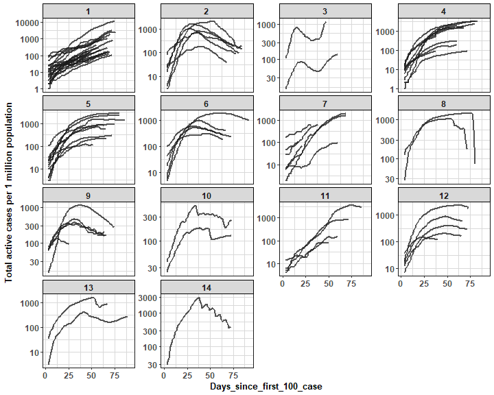
Here comes finally plot of cluster members with ggplot2 package (log scale is used for better comparison of trends):
theme_my <- theme(panel.border = element_rect(fill = NA,
                                                  colour = "grey10"),
                      panel.background = element_blank(),
                      panel.grid.minor = element_line(colour = "grey85"),
                      panel.grid.major = element_line(colour = "grey85"),
                      panel.grid.major.x = element_line(colour = "grey85"),
                      axis.text = element_text(size = 12, face = "bold"),
                      axis.title = element_text(size = 13, face = "bold"),
                      plot.title = element_text(size = 16, face = "bold"),
                      strip.text = element_text(size = 12, face = "bold"),
                      strip.background = element_rect(colour = "black"))

ggplot(data_plot,
       aes(get(colnames(data_plot)[1]),
           get(statistic),
           group = Country)) +
      facet_wrap(~Cluster,
                 ncol = ceiling(data_plot[, sqrt(uniqueN(Cluster))]),
                 scales = "free_y") +
      geom_line(color = "grey10",
                alpha = 0.75,
                size = 0.8) +
      scale_y_continuous(trans = 'log10') +
      labs(x = colnames(data_plot)[1],
           y = statistic) +
      theme_my
We can see nicely distinguishable clusters with various active cases trends (settled, rapid/ steady increase/ decrease).
Let’s check some clusters interactively with dygraphs package:
data_clust_focus <- dcast(data_plot[.(c(2,6)), on = .(Cluster)],
                          Days_since_first_100_case ~ Country,
                          value.var = statistic)

dyg <- dygraph(data_clust_focus,
        main = "Clusters n. 2 and 6") %>%
      dyAxis("x", label = colnames(data_clust_focus)[1]) %>%
      dyAxis("y", label = statistic) %>%
      dyOptions(strokeWidth = 2,
                drawPoints = F,
                pointSize = 3,
                pointShape = "circle",
                logscale = TRUE,
                colors = RColorBrewer::brewer.pal(ncol(data_clust_focus)-1, "Set2")) %>%
      dyHighlight(highlightSeriesOpts = list(strokeWidth = 2.5,
                                             pointSize = 4)) %>%
      dyLegend(width = 150, show = "follow",
               hideOnMouseOut = TRUE, labelsSeparateLines = TRUE)

saveWidget(dyg, "dyg_focus_clust_2_6.html", selfcontained = T)
Here, I picked two clusters (2 and 6) with nice decreasing trends - there are countries mostly from Central/ West Europe.
Let’s see also clusters with increasing trends of active cases per 1 mil. population:
data_clust_focus <- dcast(data_plot[.(7), on = .(Cluster)],
                          Days_since_first_100_case ~ Country,
                          value.var = statistic)

dyg <- dygraph(data_clust_focus,
               main = "Cluster n. 7") %>%
      dyAxis("x", label = colnames(data_clust_focus)[1]) %>%
      dyAxis("y", label = statistic) %>%
      dyOptions(strokeWidth = 2,
                drawPoints = F,
                pointSize = 3,
                pointShape = "circle",
                logscale = TRUE,
                colors = RColorBrewer::brewer.pal(ncol(data_clust_focus)-1, "Set2")) %>%
      dyHighlight(highlightSeriesOpts = list(strokeWidth = 2.5,
                                             pointSize = 4)) %>%
      dyLegend(width = 150, show = "follow",
               hideOnMouseOut = TRUE, labelsSeparateLines = TRUE)

saveWidget(dyg, "dyg_focus_clust_7.html", selfcontained = T)
data_clust_focus <- dcast(data_plot[.(1), on = .(Cluster)],
Days_since_first_100_case ~ Country,
value.var = statistic)
dyg <- dygraph(data_clust_focus,
main = "Cluster n. 1") %>%
dyAxis("x", label = colnames(data_clust_focus)[1]) %>%
dyAxis("y", label = statistic) %>%
dyOptions(strokeWidth = 2,
drawPoints = F,
pointSize = 3,
pointShape = "circle",
logscale = TRUE,
colors = RColorBrewer::brewer.pal(ncol(data_clust_focus)-1, "Set2")) %>%
dyHighlight(highlightSeriesOpts = list(strokeWidth = 2.5,
pointSize = 4)) %>%
dyLegend(width = 150, show = "follow",
hideOnMouseOut = TRUE, labelsSeparateLines = TRUE)
saveWidget(dyg, "dyg_focus_clust_1.html", selfcontained = T)We can see that on this day, the increasing trend of active cases has countries mostly in Western Asia, South America, and Africa.
Post-analysis visualizations with dendrograms and MDS
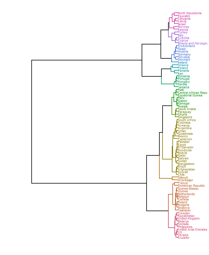
In order to see whole connectivity between countries’ clusters as a tree, we can use for example dendrogram. Here, we can simply use object of clustering result to generate the tree:
dend <- as.dendrogram(clust_res)

dend <- dend %>%
  color_branches(k = 14) %>%
  color_labels(k = 14) %>%
  set("branches_lwd", 1) %>%
  set("labels_cex", 0.8)

ggd1 <- as.ggdend(dend)

ggplot(ggd1,
       horiz = T)
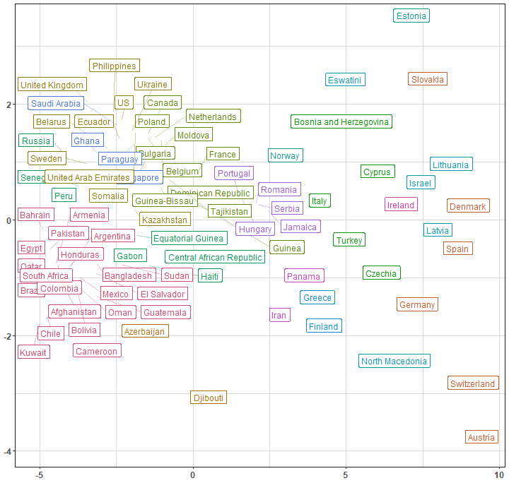
In order to see for example connections between countries in 2D scatter plot, we can use dimensionality reduction method Multidimensional scaling (MDS). It uses (stored) distance matrix between objects - and we have it in our clustering result object (Yey clust_res@distmat!). For countries labels, I use great package ggrepel.
mds_classical <- cmdscale(clust_res@distmat, eig = FALSE, k = 2)

data_plot <- data.table(mds_classical,
                        Country = row.names(mds_classical),
                        Cluster = clust_res@cluster)

ggplot(data_plot, aes(x = get("V1"),
                      y = get("V2"),
                      label = Country,
                      color = as.factor(Cluster))) +
      geom_label_repel(size = 4.2,
                       alpha = 0.95,
                       segment.alpha = 0.35,
                       label.r = 0.1,
                       box.padding = 0.25,
                       label.padding = 0.3,
                       label.size = 0.35,
                       max.iter = 2500) +
      scale_color_manual(values = colorspace::rainbow_hcl(14, c = 90, l = 50)) +
      labs(x = NULL, y = NULL, color = NULL) +
      guides(color = FALSE) +
      theme_my
In both graphs (dendrogram and MDS scatter plot), we can see clearly how far (or close) are countries from each other based on DTW distance.
Summary
In this blog post, I showed you how to cluster time series with different lengths with DTW distance and hierarchical method, and how to visualize the results of such an analysis. As a use case, I picked data of countries’ COVID-19 active cases trajectories computed per 1 mil. population to see trends of the disease spread.
Sources
Application is running on petolau.shinyapps.io platform, the source code of the whole app is on CoronaDash GitHub repository.
Take care of yourself!
Seven coffees were consumed while writing this article.
If you’ve found it valuable, please consider supporting my work and...
