Multiple Data (Time Series) Streams Clustering
Nowadays, data streams occur in many real scenarios. For example, they are generated from sensors, web traffic, satellites, and other interesting use cases. We have to process them in a fast way and extract from them as much knowledge as we can. Data streams have their own specific characteristics for processing and data mining. For example, they can be very fast, we can not process the whole history of data streams in memory, so we have to do it incrementally or in (e.g. sliding) windows.
In this post, I will cover one data streams clustering method that was developed by me. In R, you can do data stream clustering by stream package, BUT! there are methods only for one stream clustering (not multiple streams). However, I want to show you clustering of multiple data streams, so from multiple sources (e.g. sensors).
I created clustering method that is adapted for time series streams - called ClipStream [1]. This method is attribute based, so multiple attributes (features) are gathered from multiple streams windows. You can read more about it from my journal paper.
I will show you use case on smart meter data - electricity consumption time series (consumers) from London ( openly available here). Motivation for clustering such a data is to:
- extract typical patterns of consumption,
- detect outliers,
- unsupervised classification of consumers,
- create more forecastable groups of time series,
- monitor changes and behavior.
The motivation to process them as streams is the fact that the data of electricity consumption (or production) are measured every 5, 15 or 30 minutes.
ClipStream has following steps (very briefly):
- computing data streams representation for every stream (dimensionality reduction) - i.e. synopsis,
- detect outlier (anomal) streams directly from extracted representations,
- cluster non-outlier representations by K-medoids,
- assign outlier streams to nearest clusters (medoids),
- aggregate time series by clusters,
- detect changes in aggregated time series.
In this post, I will mainly focus on the first 4 parts of my approach, since there are applicable to various use cases - not only on smart meter data and its forecasting. The whole method is developed in unsupervised fashion (yey!), so representation, clustering and outlier detection of time series streams are “learned” unsupervised.
Data exploration
Firstly, read the London smart meter data, which compromise more than 4000 consumers and load all the needed packages.
library(data.table)
library(parallel)
library(cluster)
library(clusterCrit)
library(TSrepr)
library(OpenML)
library(ggplot2)
library(grid)
library(animation)
library(gganimate)
library(av)data <- OpenML::getOMLDataSet(data.id = 41060)
data <- data.matrix(data$data)Let’s subset first 1000 consumers for more simple operations.
data_cons <- data[1:1000,]
period <- 48 # frequency of time series, every day 48 measurements are gatheredLet’s plot random consumer for better imagination.
ggplot(data.table(Time = 1:ncol(data_cons),
Value = data_cons[200,])) +
geom_line(aes(Time, Value)) +
labs(y = "Consumption (kWh)") +
theme_ts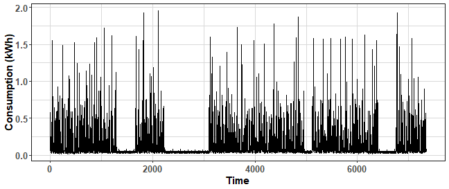
We can see stochastic behavior, but also some consumption pattern.
We can plot, for example, its average daily or weekly profile. We will do it by TSrepr’s package function repr_seas_profile.
ggplot(data.table(Time = 1:period,
Value = repr_seas_profile(data_cons[200,],
freq = period,
func = mean))) +
geom_line(aes(Time, Value)) +
geom_point(aes(Time, Value), alpha = 0.8, size = 2.5) +
scale_x_continuous(breaks = seq(1, 48, 6),
labels = paste(seq(0, 23, by = 3), "h", sep = "")) +
labs(y = "Consumption (kWh)") +
theme_ts
The peak at the start of a day…
Now, let’s plot weekly pattern:
ggplot(data.table(Time = 1:(period*7),
Value = repr_seas_profile(data_cons[200,],
freq = period*7,
func = mean))) +
geom_line(aes(Time, Value), size = 0.8) +
geom_vline(xintercept = (0:7)*period, color = "dodgerblue2",
size = 1.2, alpha = 0.7, linetype = 2) +
labs(y = "Consumption (kWh)") +
theme_ts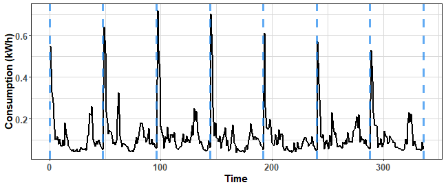
There is some change during a week.
Let’s explore the whole consumer base, but how when we have more than 1000 time series? We can cluster time series and just plot its daily patterns for example by created clusters. We will reduce the length of the visualized time series and also a number of time series in one plot.
First, extract average daily patterns, we will make it by repr_matrix function from TSrepr.
Normalization of every consumer time series - row-wise by z-score is necessary!
You can use your own normalization function (z-score and min-max methods are implemented).
data_ave_prof <- repr_matrix(data_cons,
func = repr_seas_profile,
args = list(freq = period,
func = median),
normalise = TRUE,
func_norm = norm_z)Let’s cluster computed mean daily profiles for example by K-means and to 12 clusters:
res_clust <- kmeans(data_ave_prof, 12, nstart = 20)Preprocess clustering results with data.table package and plot them:
data_plot <- data.table(melt(data_ave_prof))
data_plot[, Clust := rep(res_clust$cluster, ncol(data_ave_prof))]
data_centroid <- data.table(melt(res_clust$centers))
data_centroid[, Clust := Var1]ggplot(data_plot) +
facet_wrap(~Clust, scales = "free", ncol = 3) +
geom_line(aes(Var2, value, group = Var1), alpha = 0.7) +
geom_line(data = data_centroid, aes(Var2, value, group = Var1),
alpha = 0.8, color = "red", size = 1.2) +
scale_x_continuous(breaks = c(1,seq(12, 48, 12)),
labels = paste(seq(0, 24, by = 6), "h", sep = "")) +
theme_ts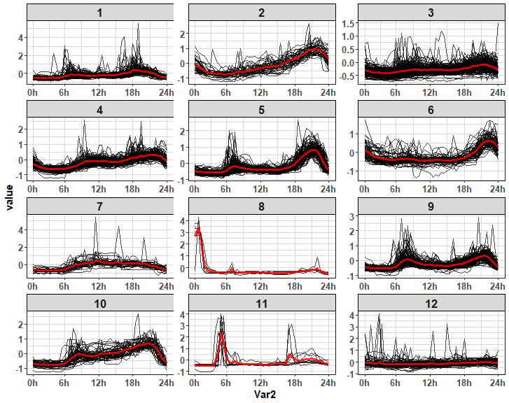
Various interesting patterns of daily consumption!
BUT (here comes motivation)! When we would like to cluster just most recent data (for example 2-3 weeks), and update it regularly every day (or even thought half-hour), automatically detect changes in time series streams and detect anomalies (outlier consumers), detect automatically the number of clusters, and make it as quickly as possible… We can not do it like in the previous case, because of computational and memory load and also accuracy. Here comes on screen more sophisticated multiple data streams clustering methods. In ClipStream that uses FeaClip time series streams representation (see my previous post about time series represetnations), a representation can be computed incrementally, clusterings are computed in data batches, outliers are detected straight from representation and etc.
FeaClip is interpretable time series representation. It extracts 8 interpretable features from clipped representation (again please see the mentioned blog post). Let’s plot representation from one day consumption time series:
ts_feaclip <- repr_feaclip(data_cons[1, 1:48])
define_region <- function(row, col){
viewport(layout.pos.row = row, layout.pos.col = col)
}
gg1 <- ggplot(data.table(Consumption = data_cons[1, 1:48],
Time = 1:48)) +
geom_line(aes(Time, Consumption)) +
geom_point(aes(Time, Consumption), size = 2, alpha = 0.8) +
geom_hline(yintercept = mean(data_cons[1, 1:48]), color = "red", size = 0.8, linetype = 7) +
theme_ts
gg2 <- ggplot(data.table(Count = ts_feaclip,
Time = 1:8)) +
geom_line(aes(Time, Count)) +
geom_point(aes(Time, Count), size = 2, alpha = 0.8) +
scale_x_continuous(breaks = 1:8, labels = names(ts_feaclip)) +
theme_ts
grid.newpage()
pushViewport(viewport(layout = grid.layout(2, 1)))
print(gg1, vp = define_region(1, 1))
print(gg2, vp = define_region(2, 1))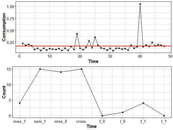
Let’s compute it also for consumption of length 2 weeks - by windows.
win <- 14
ts_feaclip_long <- repr_windowing(data_cons[1, 1:(period*win)],
func = repr_feaclip, win_size = period)
means <- sapply(0:(win-1), function(i) mean(data_cons[1, ((period*i)+1):(period*(i+1))]))
means <- data.table(Consumption = rep(means, each = period),
Time = 1:length(data_cons[1, 1:(period*win)]))
gg1 <- ggplot(data.table(Consumption = data_cons[1, 1:(period*win)],
Time = 1:(period*win))) +
geom_line(aes(Time, Consumption), alpha = 0.95) +
geom_vline(xintercept = seq(from=period,to=(period*win)-period, by=period),
alpha = 0.75, size = 1.0, col = "dodgerblue2", linetype = 2) +
geom_line(data = means, aes(Time, Consumption), color = "firebrick2",
alpha = 0.8, size = 1.2, linetype = 5) +
labs(y = "Consumption (kWh)", title = NULL, x = NULL) +
scale_x_continuous(breaks=seq(from=period/2, to=(period*win), by = period),
labels=c(1:win)) +
theme_ts
gg2 <- ggplot(data.table(Count = ts_feaclip_long,
Time = 1:length(ts_feaclip_long))) +
geom_line(aes(Time, Count)) +
geom_vline(xintercept = seq(from=8,to=(8*win)-8, by=8),
alpha = 0.75, size = 1.0, col = "dodgerblue2", linetype = 2) +
# geom_point(aes(Time, Count), size = 2, alpha = 0.8) +
scale_x_continuous(breaks=seq(from=8/2, to=(8*win), by = 8),
labels=c(1:win)) +
labs(title = NULL, x = "Day") +
theme_ts
grid.newpage()
pushViewport(viewport(layout = grid.layout(2, 1)))
print(gg1, vp = define_region(1, 1))
print(gg2, vp = define_region(2, 1))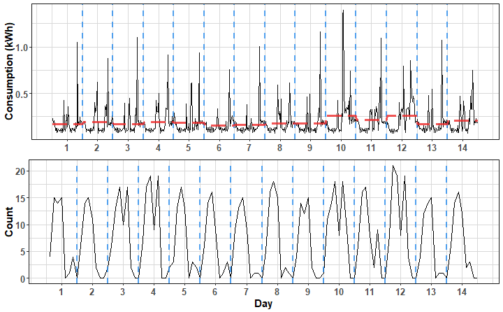
We can see the typical pattern during working days and some changes when consumption goes high - the representation adapts to these changes, but not drastically - because of the average of a window (normalization).
FeaClip animation
Now, let’s play a little bit with gganimate and av packages and visualize the behavior of FeaClip through time (stream).
First, prepare whole one time series as a stream.
# Representation
data_feaclip_all <- repr_windowing(data_cons[1,],
func = repr_feaclip,
win_size = period)
win <- 14
win_size <- 14*8
n_win <- length(data_feaclip_all)/8 - win
data_feaclip_all_anim <- sapply(0:(n_win - 1), function(i)
data_feaclip_all[((i*8)+1):((i*8) + win_size)])
data_feaclip_all_anim <- data.table(melt(data_feaclip_all_anim))
data_feaclip_all_anim[, Type := "Representation - FeaClip"]
# Original TS
win <- 14
win_size <- 14*period
n_win <- ncol(data_cons)/period - win
data_cons_anim <- sapply(0:(n_win - 1), function(i)
data_cons[1, ((i*period)+1):((i*period) + win_size)])
row.names(data_cons_anim) <- NULL
data_cons_anim <- data.table(melt(data_cons_anim))
data_cons_anim[, Type := "Original TS"]
# Together
data_plot <- rbindlist(list(data_cons_anim,
data_feaclip_all_anim))
setnames(data_plot, "Var2", "Window")
data_vline <- data.table(Var1 = c(seq(from=period,to=(period*14)-period, by=period),
seq(from=8,to=(8*14)-8, by=8)),
Type = rep(c("Original TS", "Representation - FeaClip"),
each = 13)
)Now, create ggplot animation object by ggplot and gganimate functions.
gg_anim <- ggplot(data_plot) +
facet_wrap(~Type, scales = "free", ncol = 1) +
geom_line(aes(Var1, value)) +
geom_vline(data = data_vline, aes(xintercept = Var1),
alpha = 0.75, size = 0.8, col = "dodgerblue2", linetype = 2) +
labs(x = "Length", y = NULL,
title = "Time series and its representation, Window: {frame_time}") +
theme_ts +
transition_time(Window)Let’s animate!
gganimate::animate(gg_anim, fps = 2, nframes = n_win,
width = 720, height = 450, res = 120,
renderer = av_renderer('animation.mp4'))We can see how FeaClip representation adapts on different behavior of electricity consumption - when it’s low around zero, or it gets high etc. - it makes drastic noise reduction and extracts only key features from the time series.
Multiple Data Streams
We already got a picture of one consumer time series stream. Let’s again play with the whole customer base (in our playing scenario with 1000 consumers). In this part, I would like to make nice animation of outlier detection and clustering phase in one image.
First iteration
Let’s get through the first iteration (window) of streams processing and clustering of ClipStream. So, first thing to do is to subset window of time series streams and compute FeaClip representations (the most recent window of length 14 days as in the previous case).
i = 0
data_win <- data_cons[, ((i*period)+1):((i+win)*period)]
data_clip <- repr_matrix(data_win, func = repr_feaclip,
windowing = T, win_size = period)The second phase is an outlier detection from streams. This is done by “simple” IQR-quantile method from 2 key FeaClip features - Sum_1 and number of crossings.
The source code for function detectOutliersIQR is in the ClipStream method repo. Let’s do it.
outliers <- detectOutliersIQR(data_clip, treshold = 1.5)Let’s show outlier consumers with PCA:
pc_clip <- prcomp(data_clip, center = T, scale. = T)$x[,1:2]
pc_clip <- data.table(pc_clip,
Outlier = factor(outliers$class))
levels(pc_clip$Outlier) <- c("Outlier", "Normal")
ggplot(pc_clip) +
geom_point(aes(PC1, PC2, fill = Outlier, shape = Outlier),
size = 2.8, alpha = 0.75) +
scale_shape_manual(values = c(24, 21)) +
scale_fill_manual(values = c("salmon", "dodgerblue3")) +
labs(title = paste("N.of.Outliers: " , nrow(pc_clip[Outlier == "Outlier"]))) +
theme_ts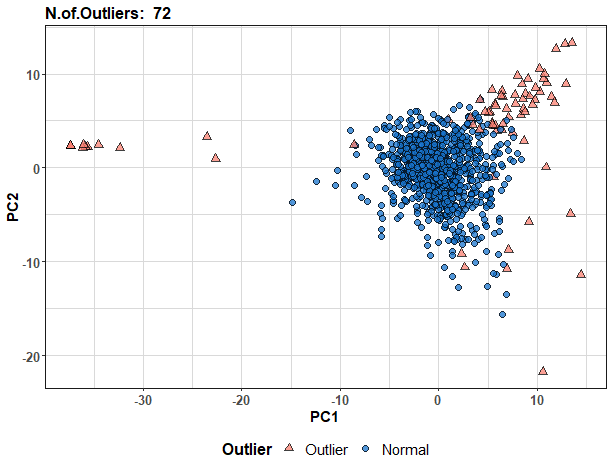
They are nicely located at the periphery of the feature space. Let’s find some outlier consumers and plot them:
which(pc_clip$PC2 == max(pc_clip$PC2))## [1] 597which(pc_clip$PC1 == min(pc_clip$PC1)) # zeros## [1] 562 908 961ggplot(data.table(Time = 1:ncol(data_win),
Value = data_win[which(pc_clip$PC2 == max(pc_clip$PC2)),])) +
geom_line(aes(Time, Value)) +
labs(y = "Consumption (kWh)") +
theme_ts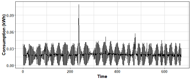
ggplot(data.table(Time = 1:ncol(data_win),
Value = data_win[which(pc_clip$PC1 == min(pc_clip$PC1))[1],])) +
geom_line(aes(Time, Value)) +
labs(y = "Consumption (kWh)") +
theme_ts
The first scenario is a consumer with a few large moments of high consumption and lot of crossings. The second scenario is the zero consumption type of a consumer.
The clustering phase is executed by an automatic K-medoids method. The number of clusters is automatically selected by the Davies-Bouldin index from the predefined range of clusters. We will cluster only non-outlier representations, for the reduction of data and also higher stability of clustering results.
# n.of.clusters range
k.min <- 8
k.max <- 15
clip_filtered <- data_clip[-outliers$outliers,]
clus_res <- clusterOptimKmedoidsDB(clip_filtered, k.min, k.max, 4,
criterium = "Davies_Bouldin")
clustering <- outliers$class
clustering[which(clustering == 1)] <- clus_res$clusteringLet’s assign outliers to nearest clusters (i.e. to nearest medoids).
out_clust <- sapply(seq_along(outliers$outliers),
function(z)
my_knn(clus_res$medoids,
as.numeric(data_clip[outliers$outliers[z],])))
clustering[which(clustering == 0)] <- out_clustIn the plot, average daily FeaClip representations will be plotted, because of the longer length of original FeaClip representation.
ave_clip <- repr_matrix(data_clip, func = repr_seas_profile,
args = list(freq = 8, func = mean))
data_plot <- data.table(melt(ave_clip))
data_plot[, Clust := rep(clustering, ncol(ave_clip))]
pc_clip[,Var1 := 1:.N]
data_plot[pc_clip[, .(Var1, Outlier)], Outlier := i.Outlier, on = .(Var1)]
medoids <- data.table(melt(repr_matrix(clus_res$medoids,
func = repr_seas_profile,
args = list(freq = 8, func = mean))))
medoids[, Clust := Var1]
ggplot(data_plot) +
facet_wrap(~Clust, scales = "free", ncol = 3) +
geom_line(aes(Var2, value, group = Var1, color = Outlier), alpha = 0.7) +
geom_line(data = medoids, aes(Var2, value, group = Var1),
alpha = 0.9, color = "dodgerblue2", size = 1) +
labs(title = "Clusters of average daily FeaClip representations",
y = "Count", x = NULL) +
scale_x_continuous(breaks = 1:8, labels = c("m_1", "s_1", "m_0", "cr.",
names(ts_feaclip)[5:8])) +
scale_color_manual(values = c("salmon", "black")) +
theme_ts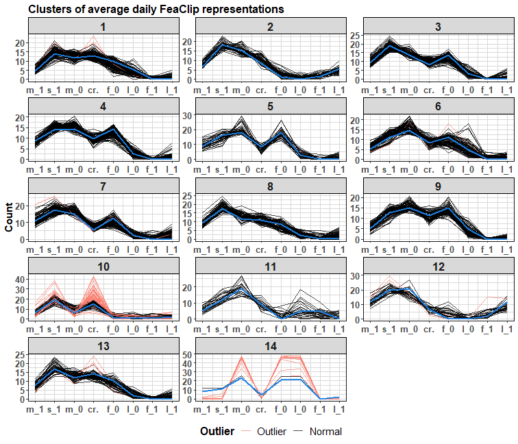
Nice distinguishable patterns.
Streaming
Now, let’s flow the data! I will make an update every new day during 50 days period and plot the results - detected outliers and clusters with also assigned outliers. The code is available on my GitHub repo. For full resolution - right click on the gif and click on the view image option.
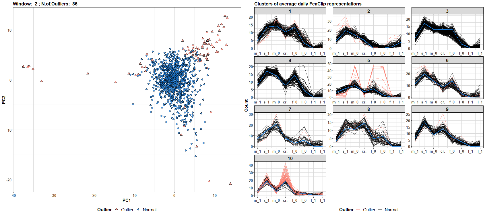
We can see that the number of outliers and clusters dynamically changes through time (daily windows). You can build your own data streams clustering algorithm with a different streams representation - for example, see TSrepr list of methods.
Conclusion
In this post, I showed you how to process and cluster multiple seasonal time series streams with the ClipStream method. I showed you also detected outliers that were automatically found from the FeaClip representation. The results of clustering can be also used for improving forecasting accuracy of aggregated consumption. For more information, read my publications about this topic in the research section.
References
[1] Laurinec, P. & Lucká, M.: Interpretable multiple data streams clustering with clipped streams representation for the improvement of electricity consumption forecasting, Data Min Knowl Disc (2018). DOI link
Seven coffees were consumed while writing this article.
If you’ve found it valuable, please consider supporting my work and...