Overview of clustering methods in R
Clustering is a very popular technique in data science because of its unsupervised characteristic - we don’t need true labels of groups in data. In this blog post, I will give you a “quick” survey of various clustering methods applied to synthetic but also real datasets.
What is clustering?
Cluster analysis or clustering is the task of grouping a set of objects in such a way that objects in the same group (called a cluster) are more similar (in some sense or another) to each other than to those in other groups (clusters).
It is a technique of unsupervised learning, so clustering is used when no a priori information about data is available. This makes clustering a very strong technique for gaining insights into data and making more accurate decisions.
What is it good for?
Clustering is used for:
- To gain insight into data, generate hypotheses, detect anomalies, and identify salient features,
- To identify the degree of similarity among objects (i.e. organisms),
- As a method for organizing the data and summarising it through cluster prototypes (compression).
Classification to groups
The first use case is to group data, e.g. classify them into groups. For explanation purposes, I will generate synthetic data from three normal distributions plus three outliers (anomalies). Let’s load needed packages, generate randomly some data, and show the first use case in the visualization:
library(data.table) # data handling
library(ggplot2) # visualisations
library(gridExtra) # visualisations
library(grid) # visualisations
library(cluster) # PAM - K-medoids

set.seed(54321)

data_example <- data.table(x = c(rnorm(10, 3.5, 0.1), rnorm(10, 2, 0.1),
                                 rnorm(10, 4.5, 0.1), c(5, 1.9, 3.95)),
                           y = c(rnorm(10, 3.5, 0.1), rnorm(10, 2, 0.1),
                                 rnorm(10, 4.5, 0.1), c(1.65, 2.9, 4.2)))

gg1 <- ggplot(data_example, aes(x, y)) +
  geom_point(alpha = 0.75, size = 8) +
  theme_bw()

kmed_res <- pam(data_example, 3)$clustering

data_example[, class := as.factor(kmed_res)]

gg2 <- ggplot(data_example, aes(x, y, color = class, shape = class)) +
  geom_point(alpha = 0.75, size = 8) +
  theme_bw()

define_region <- function(row, col){
  viewport(layout.pos.row = row, layout.pos.col = col)
}

grid.newpage()
# Create layout : nrow = 2, ncol = 2
pushViewport(viewport(layout = grid.layout(1, 2)))
# Arrange the plots
print(gg1, vp = define_region(1, 1))
print(gg2, vp = define_region(1, 2))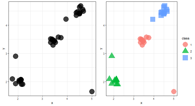
We can see three nicely divided groups of data.
Anomaly detection
Clustering can be also used as an anomaly detection technique, some methods of clustering can detect automatically outliers (anomalies). Let’s show visually what it looks like.
anom <- c(rep(1, 30), rep(0, 3))
data_example[, class := as.factor(anom)]
levels(data_example$class) <- c("Anomaly", "Normal")

ggplot(data_example, aes(x, y, color = class, shape = class)) +
  geom_point(alpha = 0.75, size = 8) +
  theme_bw()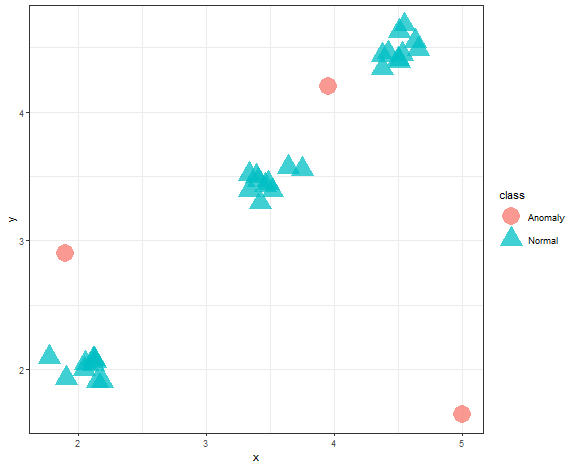
Data compression
In an era of a large amount of data (also many times used buzzword - big data), we have problems processing them in real time. Here clustering can help to reduce dimensionality by its compression feature. Created clusters, that incorporate multiple points (data), can be replaced by their representatives (prototypes) - so one point. In this way, points were replaced by its cluster representative (“+”):
data_example[, class := as.factor(kmed_res)]

centroids <- data_example[, .(x = mean(x), y = mean(y)), by = class]

ggplot(data_example, aes(x, y, color = class, shape = class)) +
  geom_point(alpha = 0.75, size = 8) +
  geom_point(data = centroids, aes(x, y), color = "black", shape = "+", size = 18) +
  theme_bw()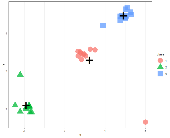
Types of clustering methods
Since cluster analysis has been here for more than 50 years, there are a large amount of available methods. The basic classification of clustering methods is based on the objective to which they aim: hierarchical, non-hierarchical.
The hierarchical clustering is a multi-level partition of a dataset that is a branch of classification (clustering). Hierarchical clustering has two types of access to data. The first one, divisive clustering, starts with one big cluster that is then divided into smaller clusters. The second one, agglomerative clustering, starts with individual objects that are single-element clusters, and then they are gradually merged. The whole process of hierarchical clustering can be expressed (visualized) as a dendrogram.
The non-hierarchical clustering is dividing a dataset into a system of disjunctive subsets (clusters) so that an intersection of clusters would be an empty set.
Clustering methods can be also divided in more detail based on the processes in the method (algorithm) itself:
Non-hierarchical:
- Centroid-based
- Model-based
- Density-based
- Grid-based
Hierarchical:
- Agglomerative
- Divisive
But which to choose in your use case? Let’s dive deeper into the most known methods and discuss their advantages and disadvantages.
Centroid-based
The most basic (maybe just for me) type of clustering method is centroid-based. This type of clustering creates prototypes of clusters - centroids or medoids.
The best well-known methods are:
- K-means
- K-medians
- K-medoids
- K-modes
K-means
Steps:
- Create random K clusters (and compute centroids).
- Assign points to the nearest centroids.
- Update centroids.
- Go to step 2 while the centroids are changing.
Pros and cons:
- [+] Fast to compute. Easy to understand.
- [-] Various initial clusters can lead to different final clustering.
- [-] Scale-dependent.
- [-] Creates only convex (spherical) shapes of clusters.
- [-] Sensitive to outliers.
K-means - example
It is very easy to try K-means in R (by the kmeans function), only needed parameter is a number of clusters.
km_res <- kmeans(data_example, 3)$cluster

data_example[, class := as.factor(km_res)]

centroids <- data_example[, .(x = mean(x), y = mean(y)), by = class]

ggplot(data_example, aes(x, y, color = class, shape = class)) +
  geom_point(alpha = 0.75, size = 8) +
  geom_point(data = centroids, aes(x, y), color = "black", shape = "+", size = 18) +
  theme_bw()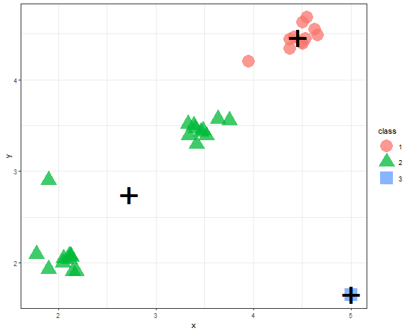
We can see example, when K-means fails most often, so when there are outliers in the dataset.
K-medoids
The problem with outliers solves K-medoids because prototypes are medoids - members of the dataset. So, not artificially created centroids, which helps to tackle outliers.
Pros and cons:
- [+] Easy to understand.
- [+] Less sensitive to outliers.
- [+] Possibility to use any distance measure.
- [-] Various initial clusters can lead to different final clustering.
- [-] Scale-dependent.
- [-] Slower than K-means.
K-medoids - example
K-medoids problem can be solved by the Partition Around Medoids (PAM) algorithm (function pam in cluster package).
kmed_res <- pam(data_example[, .(x, y)], 3)
data_example[, class := as.factor(kmed_res$clustering)]

medoids <- data.table(kmed_res$medoids, class = as.factor(1:3))

ggplot(data_example, aes(x, y, color = class, shape = class)) +
  geom_point(alpha = 0.75, size = 8) +
  geom_point(data = medoids, aes(x, y, shape = class),
             color = "black", size = 11, alpha = 0.7) +
  theme_bw() +
  guides(shape = "none")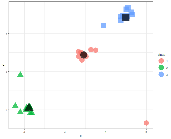
We can see that medoids stayed nicely in the three main groups of data.
The determination of the number of clusters
The disadvantage of centroid-based methods is that the number of clusters needs to be known in advance (it is a parameter of the methods). However, we can determine the number of clusters by its Internal validation (index). Basic steps are based on that we compute some internal validation index with many ( K ) and we choose ( K ) with the best index value.
Many indexes are there…
- Silhouette
- Davies-Bouldin index
- Dunn index
- etc.
However, every index has similar characteristics:
\[\frac{within-cluster-similarity}{between-clusters-similarity} .\]so, it is the ratio of the average distances in clusters and between clusters.
Elbow diagram
The Elbow diagram is a simple method (rule) how to determine the number of clusters - we compute the internal index with a set of K and choose K where positive change is largest.
So for example, I chose the Davies-Bouldin index implemented in the clusterCrit package. For our simple dataset, I will generate clusterings with 2-6 number of clusters and compute the index.
library(clusterCrit)

km_res_k <- lapply(2:6, function(i) kmeans(data_example[, .(x, y)], i)$cluster)
km_res_k
## [[1]]
## [1] 2 2 2 2 2 2 2 2 2 2 1 1 1 1 1 1 1 1 1 1 2 2 2 2 2 2 2 2 2 2 2 1 2
##
## [[2]]
## [1] 3 3 3 3 3 3 3 3 3 3 2 2 2 2 2 2 2 2 2 2 1 1 1 1 1 1 1 1 1 1 3 2 1
##
## [[3]]
## [1] 1 1 1 1 1 1 1 1 1 1 4 4 4 4 4 4 4 4 4 4 3 3 3 3 3 3 3 3 3 3 2 4 3
##
## [[4]]
## [1] 5 5 5 5 5 5 5 5 5 5 2 2 2 2 2 2 2 2 2 2 3 3 3 3 3 3 3 3 3 3 4 1 3
##
## [[5]]
## [1] 1 1 1 1 1 1 1 5 5 1 6 6 6 6 6 6 6 6 6 6 3 3 3 3 3 3 3 3 3 3 2 6 4db_km <- lapply(km_res_k, function(j) intCriteria(data.matrix(data_example[, .(x, y)]),
j,
"Davies_bouldin")$davies_bouldin)
ggplot(data.table(K = 2:6, Dav_Boul = unlist(db_km)), aes(K, Dav_Boul)) +
geom_line() +
geom_point() +
theme_bw()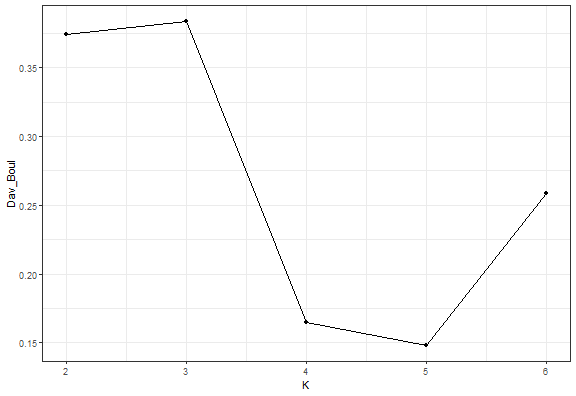
data_example[, class := as.factor(km_res_k[[which.min(c(0,diff(unlist(db_km))))]])]

ggplot(data_example, aes(x, y, color = class, shape = class)) +
  geom_point(alpha = 0.75, size = 8) +
  theme_bw()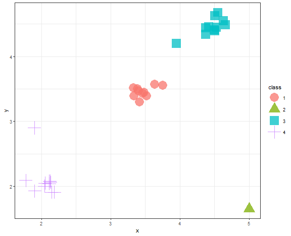
We can see that the Elbow diagram rule chose 4 clusters - makes sense to me actually…
We can also try it with PAM - K-medoids.
kmed_res_k <- lapply(2:6, function(i) pam(data_example[, .(x, y)], i)$clustering)

db_kmed <- lapply(kmed_res_k, function(j) intCriteria(data.matrix(data_example[, .(x, y)]),
                                                  j,
                                                  "Davies_bouldin")$davies_bouldin)

ggplot(data.table(K = 2:6, Dav_Boul = unlist(db_kmed)), aes(K, Dav_Boul)) +
  geom_line() +
  geom_point() +
  theme_bw()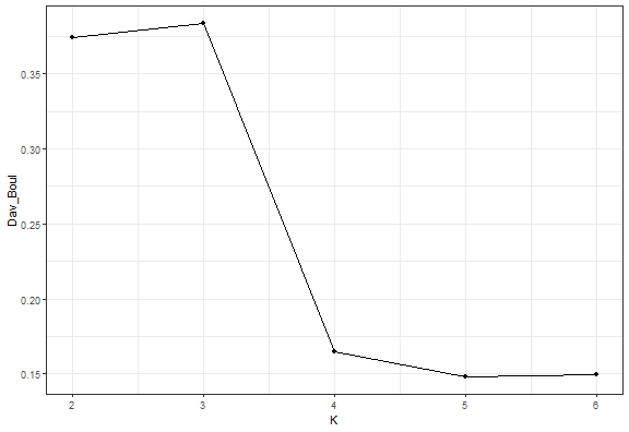
data_example[, class := as.factor(kmed_res_k[[which.min(c(0,diff(unlist(db_km))))]])]

ggplot(data_example, aes(x, y, color = class, shape = class)) +
  geom_point(alpha = 0.75, size = 8) +
  theme_bw()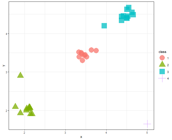
It is the same result.
Model-based
Model-based clustering methods are based on some probabilistic distribution. It can be:
- Gaussian normal distribution
- Gamma distribution
- Student’s t-distribution
- Poisson distribution
- etc.
Since we cluster multivariate data, model-based clustering uses Multivariate distributions and a so-called Mixture of models (Mixtures -> clusters). When using clustering with Gaussian normal distribution, we are using the theory of Gaussian Mixture Models (GMM).
GMM
The target is to maximize likelihood: \(L(\boldsymbol{\mu_1}, \dots, \boldsymbol{\mu_k}, \boldsymbol{\Sigma_1}, \dots, \boldsymbol{\Sigma_k} | \boldsymbol{x_1}, \dots, \boldsymbol{x_n}).\) Here, cluster is represented by mean (( \mathbf{\mu} )) and covariance matrix (( \mathbf{\Sigma} )). So not just centroid as in the case of K-means.
This optimization problem is typically solved by the EM algorithm (Expectation Maximization).
Pros and cons:
- [+] Ellipsoidal clusters,
- [+] Can be parameterized by covariance matrix,
- [+] Scale-independent,
- [-] Very slow for high-dimensional data,
- [-] Can be difficult to understand.
EM algorithm with GMM is implemented in the mclust package. You can optimize various shapes of mixtures (clusters) by the modelNames parameter (check the ?mclustModelNames function for more details).
library(mclust)
res <- Mclust(data_example[, .(x, y)], G = 3, modelNames = "VVV", verbose = FALSE)

plot(res, what = "classification")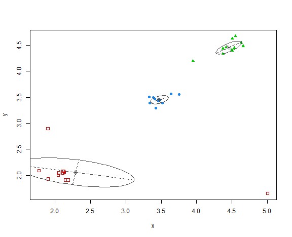
Pretty interesting red ellipse that was created, but generally clustering is OK.
BIC
The Bayesian Information Criterion (BIC) for choosing the optimal number of clusters can be used with model-based clustering.
In the mclust package, you can just add multiple modelNames and it chooses by BIC the best one.
We can try also to vary the dependency of covariance matrix ( \mathbf{\Sigma} ).
res <- Mclust(data_example[, .(x, y)], G = 2:6, modelNames = c("VVV", "EEE", "VII", "EII"), verbose = FALSE)
res
## 'Mclust' model object: (EII,6)
##
## Available components:
## [1] "call" "data" "modelName" "n" "d" "G" "BIC" "loglik" "df" "bic" "icl"
## [12] "hypvol" "parameters" "z" "classification" "uncertainty"plot(res, what = "BIC")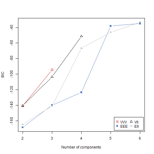
The result:
plot(res, what = "classification")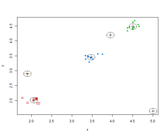
So, the methodology chose 6 clusters - 3 main groups of data and all 3 anomalies in separate clusters.
Density-based
Density-based clusters are based on maximally connected components of the set of points that lie within some defined distance from some core object.
Methods:
DBSCAN
In the well-known method DBSCAN, density is defined as neighborhood, where points have to be reachable within a defined distance (( \epsilon ) distance - first parameter of the method), however, clusters must have at least some number of minimal points (second parameter of the method). Points that weren’t connected with any cluster and did not pass the minimal points criterion are marked as noise (outliers).
Pros and cons:
- [+] Extracts automatically outliers,
- [+] Fast to compute,
- [+] Can find clusters of arbitrary shapes,
- [+] The number of clusters is determined automatically based on data,
- [-] Parameters (( \epsilon ), minPts) must be set by a practitioner,
- [-] Possible problem with neighborhoods - can be connected.
DBSCAN is implemented in the same named function and package, so let’s try it.
library(dbscan)

res <- dbscan(data_example[, .(x, y)], eps = 0.4, minPts = 5)
table(res$cluster)
##
## 0 1 2 3
## 3 10 10 10data_example[, class := as.factor(res$cluster)]
levels(data_example$class)[1] <- c("Noise")
ggplot(data_example, aes(x, y, color = class, shape = class)) +
geom_point(alpha = 0.75, size = 8) +
theme_bw() +
scale_shape_manual(values = c(3,16,17,18))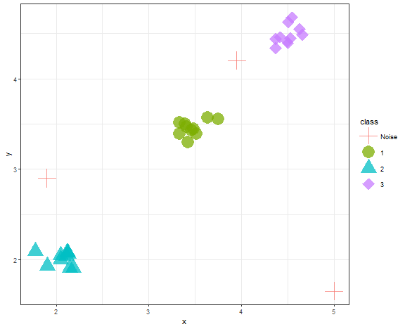
We can see that DBSCAN found 3 clusters and 3 outliers correctly when parameters are wisely chosen.
Bananas - DBSCAN result
To demonstrate the strength of DBSCAN, researchers created many dummy artificial datasets, which are many times called bananas.
bananas <- fread("_rmd/t7.10k.dat")
db_res <- dbscan(bananas, eps = 10, minPts = 15)

data_all <- data.table(bananas, class = as.factor(db_res$cluster))

library(ggsci)
ggplot(data_all, aes(V1, V2, color = class, shape = class)) +
  geom_point(alpha = 0.75) +
  scale_color_d3() +
  scale_shape_manual(values = c(3, rep(16, 9))) +
  theme_bw()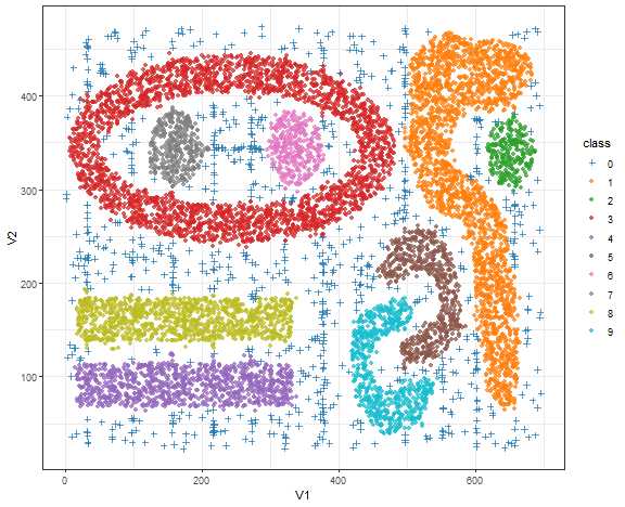
Bananas - K-means result
km_res <- kmeans(bananas, 9)
data_all[, class := as.factor(km_res$cluster)]

ggplot(data_all, aes(V1, V2, color = class)) +
  geom_point(alpha = 0.75) +
  scale_color_d3() +
  theme_bw()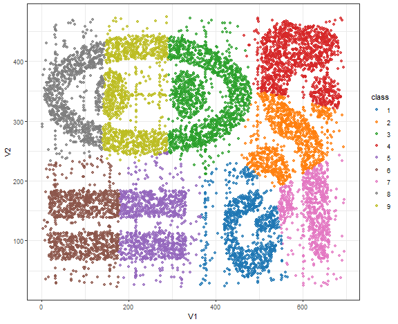
K-means here is not a good choice obviously…but these datasets are far from real-world either.
Spectral clustering
Spectral clustering methods are based on the spectral decomposition of data, so the creation of eigen vectors and eigen values.
Steps:
- N = number of data, d = dimension of data,
- ( \mathbf{A} ) = affinity matrix, ( A_{ij} = \exp(- (data_i - data_j)^2 / (2*\sigma^2) ) ) - N by N matrix,
- ( \mathbf{D} ) = diagonal matrix whose (i,i)-element is the sum of ( \mathbf{A} ) i-th row - N by N matrix,
- ( \mathbf{L} ) = ( \mathbf{D}^{-1/2} \mathbf{A} \mathbf{D}^{-1/2} ) - N by N matrix,
- ( \mathbf{X} ) = union of k largest eigenvectors of ( \mathbf{L} ) - N by k matrix,
- Renormalising each of ( \mathbf{X} ) rows to have unit length - N by k matrix,
- Run K-means algorithm on ( \mathbf{X} ).
Typical use case for spectral clustering
We will try spectral clustering on the Spirals artificial dataset.
data_spiral <- fread("_rmd/data_spiral.csv")

ggplot(data_spiral, aes(x, y, color = as.factor(label), shape = as.factor(label))) +
  geom_point(size = 2) +
  theme_bw()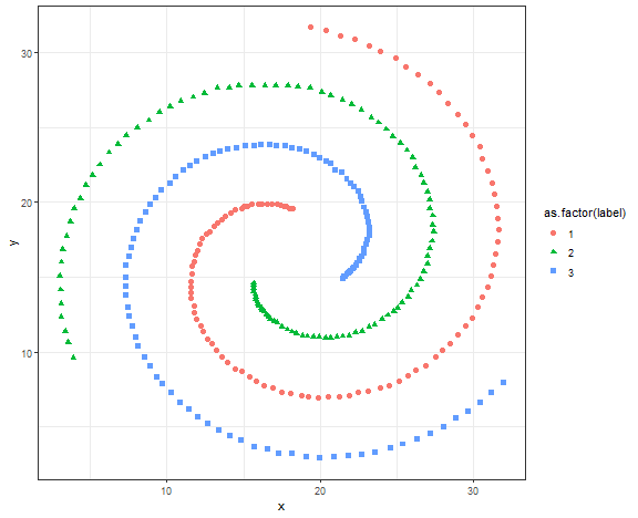
Spectral clustering is implemented in the kernlab package and specc function.
library(kernlab)

res <- specc(data.matrix(data_spiral[, .(x, y)]), centers = 3)

data_spiral[, class := as.factor(res)]

ggplot(data_spiral, aes(x, y, color = class, shape = class)) +
  geom_point(size = 2) +
  theme_bw()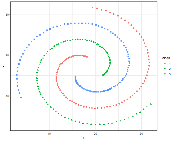
Let’s it try on more advanced data - compound data.
data_compound <- fread("_rmd/data_compound.csv")

ggplot(data_compound, aes(x, y, color = as.factor(label), shape = as.factor(label))) +
  geom_point(size = 2) +
  theme_bw()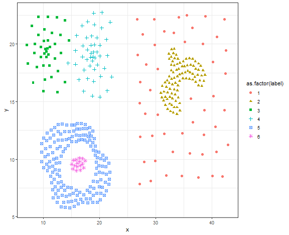
res <- specc(data.matrix(data_compound[, .(x, y)]), centers = 6)

data_compound[, class := as.factor(res)]

ggplot(data_compound, aes(x, y, color = class, shape = class)) +
  geom_point(size = 2) +
  theme_bw()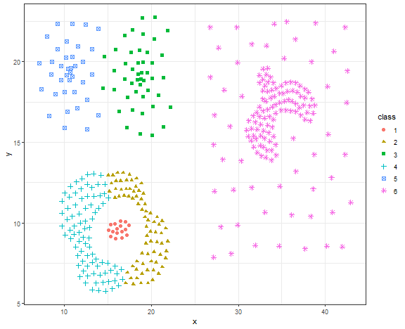
This is not a good result, let’s try DBSCAN.
db_res <- dbscan(data.matrix(data_compound[, .(x, y)]), eps = 1.4, minPts = 5)
# db_res

data_compound[, class := as.factor(db_res$cluster)]

ggplot(data_compound, aes(x, y, color = class, shape = class)) +
  geom_point(size = 2) +
  theme_bw()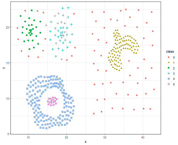
Again, the nice result for DBSCAN on the artificial dataset.
Hierarchical clustering
The result of a hierarchical clustering is a dendrogram. The dendrogram can be cut at any height to form a partition of the data into clusters. How data points are connected in the dendrogram has multiple possible ways (linkages) and criteria:
- Single-linkage
- Complete-linkage
- Average-linkage
- Centroid-linkage
- Ward’s minimum variance method
- etc.
Criteria:
- single-linkage: ( \min { d(a,b):a\in A, b\in B } )
- complete-linkage: ( \max { d(a,b):a\in A, b\in B } )
-
average-linkage: ( \frac{1}{ A B }\sum_{a\in A}\sum_{b\in B}d(a,b) ) -
centroid-linkage: ( c_t - c_s ), where ( c_s ) and ( c_t ) are the centroids of clusters ( s ) and ( t ).
where ( d(a,b) ) is the distance between points ( a ) and ( b ).
IRIS dataset use case
Let’s try hierarchical clustering on the IRIS dataset.
ggplot(iris, aes(Sepal.Length, Sepal.Width, color = Species)) +
  geom_point(alpha = 0.8, size = 5) +
  theme_bw()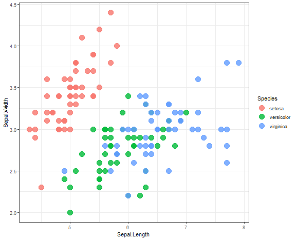
Single linkage:
library(ggdendro)
library(dendextend)

data_m <- iris[,-5]

hie_single <- hclust(dist(data_m), method = "single")
dend <- as.dendrogram(hie_single)
dend <- dend %>% set("branches_k_color", k = 3) %>%
  set("branches_lwd", 1.2) %>%
  set("labels", rep(c("set", "ver", "vir"), each = 50)) %>%
  set("labels_colors", rep(c("red", "green", "blue"), each = 50)) %>%
  set("labels_cex", 0.6)
ggd1 <- as.ggdend(dend)
ggplot(ggd1)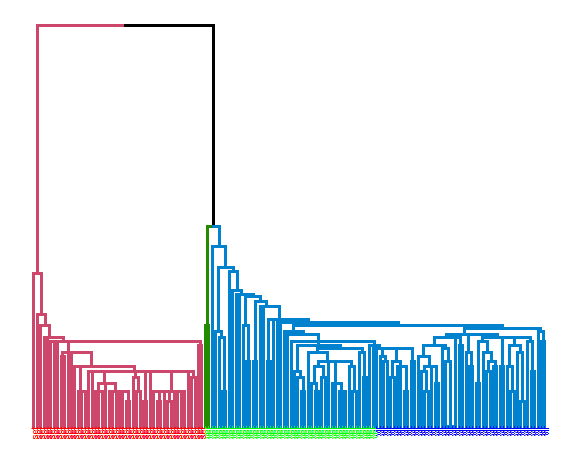
Complete linkage:
hie_complete <- hclust(dist(data_m), method = "complete")
dend <- as.dendrogram(hie_complete)
dend <- dend %>% set("branches_k_color", k = 3) %>%
  set("branches_lwd", 1.2) %>%
  set("labels", rep(c("set", "ver", "vir"), each = 50)) %>%
  set("labels_colors", rep(c("red", "green", "blue"), each = 50)) %>%
  set("labels_cex", 0.6)
ggd1 <- as.ggdend(dend)
ggplot(ggd1)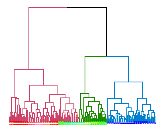
Average linkage:
hie_ave <- hclust(dist(data_m), method = "average")
dend <- as.dendrogram(hie_ave)
dend <- dend %>% set("branches_k_color", k = 3) %>%
  set("branches_lwd", 1.2) %>%
  set("labels", rep(c("set", "ver", "vir"), each = 50)) %>%
  set("labels_colors", rep(c("red", "green", "blue"), each = 50)) %>%
  set("labels_cex", 0.6)
ggd1 <- as.ggdend(dend)
ggplot(ggd1)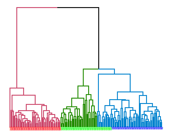
Let’s compute the precision of these three clusterings with the clusterCrit package:
extCriteria(as.integer(iris[,5]), cutree(hie_single, 3), crit = "Precision")## $precision
## [1] 0.5985951extCriteria(as.integer(iris[,5]), cutree(hie_complete, 3), crit = "Precision")## $precision
## [1] 0.7225295extCriteria(as.integer(iris[,5]), cutree(hie_ave, 3), crit = "Precision")## $precision
## [1] 0.8191682The best results were obtained with average linkage with precision of 81.9%.
Connected data
I have prepared for you the last use case for most shown methods where data (and clusters) are closely connected, so the closest scenario of real data.
set.seed(5)
library(MASS)

data_connected <- as.data.table(rbind(
  mvrnorm(220, mu = c(3.48, 3.4), Sigma = matrix(c(0.005, -0.015, -0.01, 0.09), nrow = 2)),
  mvrnorm(280, mu = c(3.8, 3.8), Sigma = matrix(c(0.05, 0, 0, 0.05), nrow = 2)),
  mvrnorm(220, mu = c(3.85, 2.9), Sigma = matrix(c( 0.1, 0.03, 0.03, 0.017), nrow = 2))
  ))

setnames(data_connected, c("V1", "V2"), c("x", "y"))

ggplot(data_connected, aes(x, y)) +
  geom_point(alpha = 0.75, size = 2) +
  theme_bw()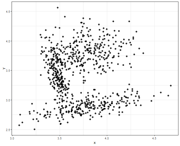
DBSCAN - result for connected data
Chosen parameters are ( \epsilon = 0.08 ), ( minPts = 18 ).
db_res <- dbscan(data_connected, eps = 0.08, minPts = 18)data_all <- data.table(data_connected, class = as.factor(db_res$cluster))
ggplot(data_all, aes(x, y, color = class)) +
geom_point(alpha = 0.75, size = 2) +
theme_bw()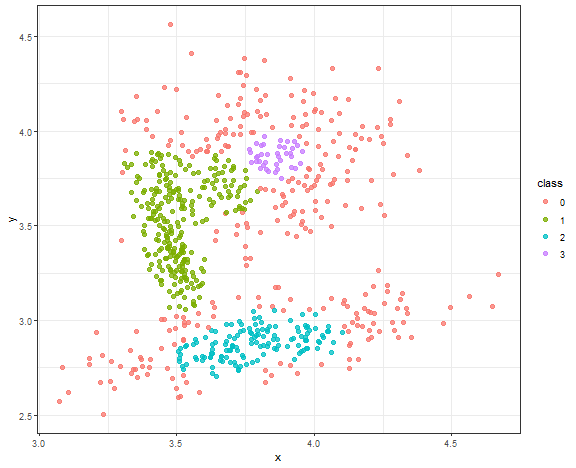
The result is quite good enough, where the main three core groups are identified. Let’s change minPts to 10.
db_res <- dbscan(data_connected, eps = 0.08, minPts = 10)
data_all <- data.table(data_connected, class = as.factor(db_res$cluster))

ggplot(data_all, aes(x, y, color = class)) +
  geom_point(alpha = 0.75, size = 2) +
  theme_bw()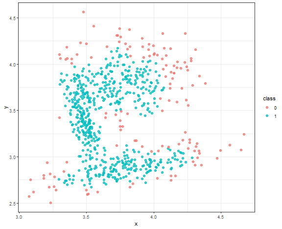
We can see a use case where DBSCAN is very sensitive to parameter settings, and you have to be very careful with some automatic settings of these parameters (in your use cases).
K-means - result for connected data
km_res <- kmeans(data_connected, 3)

data_all[, class := as.factor(km_res$cluster)]

ggplot(data_all, aes(x, y, color = class)) +
  geom_point(alpha = 0.75, size = 2) +
  theme_bw()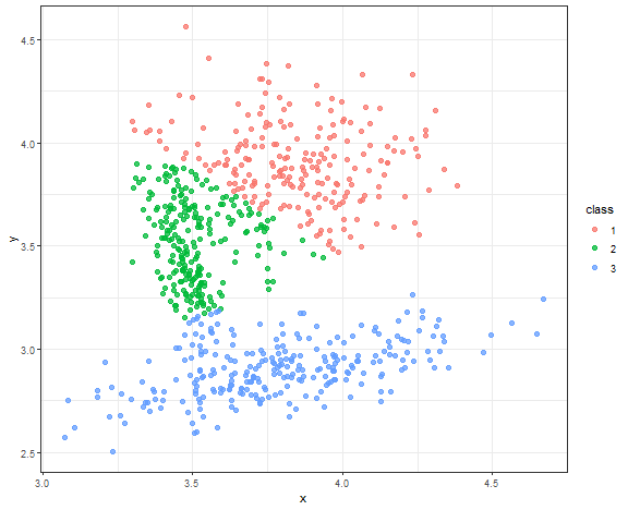
Nice result to be fair for this simple method.
Gaussian model-based clustering result
m_res <- Mclust(data_connected, G = 3, modelNames = "VVV", verbose = FALSE)

data_all[, class := as.factor(m_res$classification)]

ggplot(data_all, aes(x, y, color = class)) +
  geom_point(alpha = 0.75, size = 2) +
  theme_bw()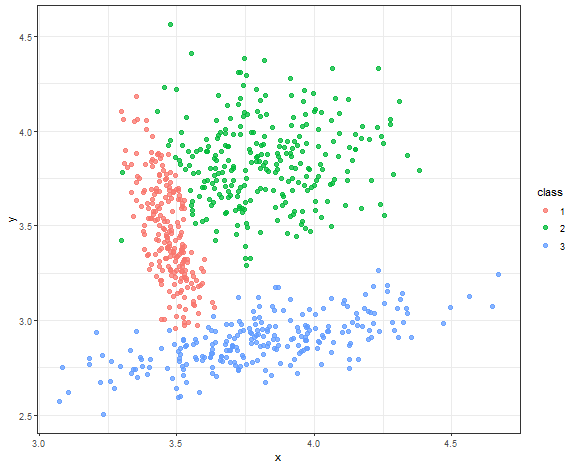
Almost perfect result, but due to the normality of sampled data.
Spectral clustering result
res <- specc(data.matrix(data_connected[, .(x, y)]), centers = 3)

data_all[, class := as.factor(res)]

ggplot(data_all, aes(x, y, color = class)) +
  geom_point(alpha = 0.75, size = 2) +
  theme_bw()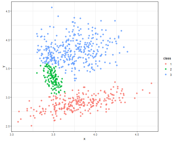
Very nice result again!
Other types of clustering methods
Other types of clustering methods that were not covered in this blog post are:
- Grid-based
- Subspace clustering
- Multi-view clustering
- Based on artificial neural networks (e.g. SOM)
- Consensus (ensemble) clustering
- Data stream(s) clustering
- etc.
Conclusions
- We have many types of clustering methods
- Different datasets need different clustering methods
- Automatic determination of a number of clusters can be tricky
- Real datasets are usually connected - density-based methods can fail
- Outliers (anomalies) can significantly influence clustering results - the solution is to preprocess the data or use density-based clustering
- Some methods are not suited for large (or high-dimensional) datasets - model-based or spectral clustering
- Some methods are not suited for non-convex clusters - K-means, basic hierarchical clustering
Seven coffees were consumed while writing this article.
If you’ve found it valuable, please consider supporting my work and...
