Doing magic and analyzing seasonal time series with GAM (Generalized Additive Model) in R
As I wrote in the previous post, I will continue in describing regression methods, which are suitable for double seasonal (or multi-seasonal) time series. In the previous post about Multiple Linear Regression, I showed how to use “simple” OLS regression method to model double seasonal time series of electricity consumption and use it for accurate forecasting. Interactions between two seasonal variables were successfully used to achieve this goal. The issue of forecasting time series from smart meters was discussed in my first post.
In this post (tutorial), I will fully introduce a “magical” Generalized Additive Model (GAM) to model time series of electricity consumption. You may wonder, why words “magic” or “magical” are mentioned? You will get your answer later in this post ![]()
Now I have to warn you that this blog post is very long. GAM is a very complex method and I wanted to go little bit deeper in order to show you this interesting regression method. I think it will be worth it and in the end of the post, I hope you will understand the theory behind R functions. In my opinion, R blogging (or any data mining or machine learning blogging) without theory interpretation of used methods has zero informative value for a reader.
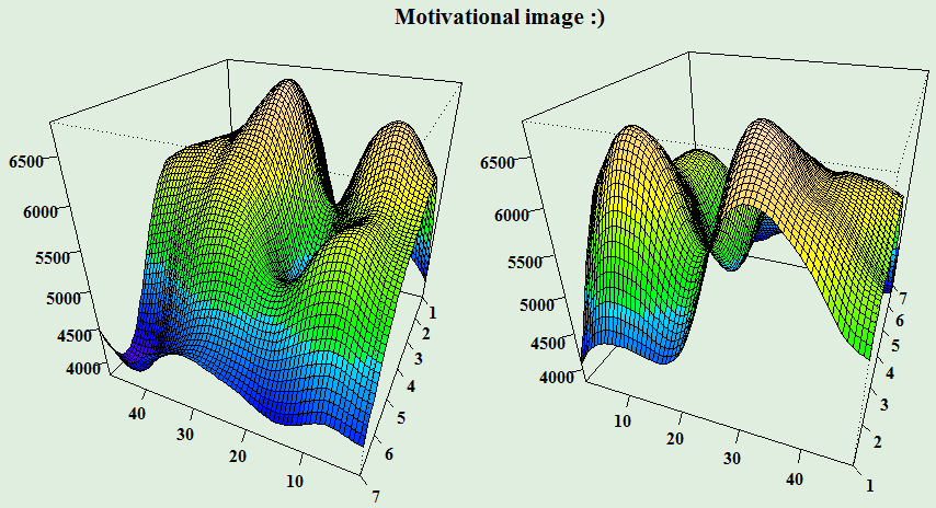
So, let’s look under the roof of the GAM regression method. I think you need some motivation to it – here it is!
Theory behind Generalized Additive Model (GAM)
What do these three words (or letters) in the name of this method mean and where does it come from? I am sure that you know something about Linear Model (maybe because you had read my previous post about MLR ![]() ). It is a simple regression method which models the response (dependent) variable by independent variable(s). It’s solved by the OLS method. So now we know, what the M in the name means. When we want to linearly model a response variable which is not from normal Gaussian distribution, for example, it can be binary (logistic regression) or discrete (Poisson) variable, we can use a generalization of the linear model - Generalized Linear Model (GLM). It’s solved by the iteratively reweighted least squares (IRLS) method. The G in the name is also clear. The A letter Additive Model, means that the response variable depends linearly on unknown smooth functions. In the other words, the goal is to model the response variable by independent variables, which are in the form of some smooth functions. Voilà, GAM is created.
). It is a simple regression method which models the response (dependent) variable by independent variable(s). It’s solved by the OLS method. So now we know, what the M in the name means. When we want to linearly model a response variable which is not from normal Gaussian distribution, for example, it can be binary (logistic regression) or discrete (Poisson) variable, we can use a generalization of the linear model - Generalized Linear Model (GLM). It’s solved by the iteratively reweighted least squares (IRLS) method. The G in the name is also clear. The A letter Additive Model, means that the response variable depends linearly on unknown smooth functions. In the other words, the goal is to model the response variable by independent variables, which are in the form of some smooth functions. Voilà, GAM is created.
The GAM can be formally written as:
\[g(E(y_i)) = \beta_0 + f_1(x_{i1}) + \dots + f_p(x_{ip}) + \varepsilon_i,\] \[y_i \sim \mbox{some exponential family distribution,}\]where \( i = 1, \dots, N \), \( g \) is a link function (identical, logarithmic or inverse), \( y \) is a response variable, \( x_1, \dots, x_p \) are independent variables, \( \beta_0 \) is an intercept, \( f_1, \dots, f_p \) are unknown smooth functions and \( \varepsilon \) is an i.i.d. random error.
The smooth function \( f \) is composed by sum of basis functions \( b \) and their corresponding regression coefficients \( \beta \), formally written:
\[f(x) = \sum_{i = 1}^q b_i(x)\beta_i,\] \[\mbox{ where } q \mbox{ is basis dimension.}\]Smooth functions are also called splines. Smoothing splines are real functions that are piecewise-defined by polynomial functions (basis functions). The places, where the polynomial pieces connect are called knots. In GAMs, penalized regression splines are used in order to regularize the smoothness of a spline.
Therefore, the model can be written in a linear way like this:
\[g(E(y)) = \beta\mathbf{X} + \varepsilon,\]where \( \mathbf{X} \) is a model matrix and \( \beta \) is a vector of regression coefficients.
Then, the objective function to be minimized is:
\[\parallel y - \beta\mathbf{X}\parallel^2 + \lambda\int_0^1 [f^{''}(x)]^2dx,\]where \( \lambda \) is a smoothing parameter and the integral of squares of second derivatives can be written as:
\[\int_0^1 [f^{''}(x)]^2dx = \beta^T\mathbf{S}\beta,\]where \( \mathbf{S} \) is matrix of known coefficients.
All this mathematical madness then implies that regression coefficients can be obtained (estimated) by the equation:
\[\hat{\beta} = (\mathbf{X}^T\mathbf{X} + \lambda\mathbf{S})^{-1}\mathbf{X}^Ty.\]\( \hat{\beta} \) is called penalized least squares estimator in this case. The method of obtaining the estimate of the \( \beta \) is called Penalized Iteratively Re-weighted Least Squares (P-IRLS).
There are some more important theoretical questions to answer. For example, what kind of smoothing splines exists? Or, how to choose an optimal smoothing parameter \( \lambda \)? How basis dimensions (or a number of knots) are set?
There are several smoothing bases \( b \) (splines) which are suitable for regression:
- thin plate regression splines
- cubic regression spline
- cyclic cubic regression spline
- P-splines
An example of the cubic basis function for dimension \( q = 3 \):
\[\begin{equation*} b_{cubic}(x) = \begin{cases} \frac{1}{4}(x+2)^3 & \text{if } -2 \leq x \leq -1,\\ \frac{1}{4}(3|x|^3-6x^2+4) & \text{if } -1 \leq x \leq 1,\\ \frac{1}{4}(2-x)^3 & \text{if } \hspace{0.48cm} 1 \leq x \leq 2. \end{cases} \end{equation*}\]You can read more about them in references, which I will write up. In this post, for daily seasonality cubic regression spline, and for weekly seasonality P-splines will be used. Both types of splines are knot-based, so choosing a right number of knots will be important.
Next, an important procedure is to choose (estimate) an optimal smoothing parameter \( \lambda \) and the number of basis dimensions (i.e. degrees of freedom). This can be done in GAM by Generalized Cross Validation score (GCV). It minimizes an equation:
\[\nu_g = \frac{n\sum_{i=1}^n (y_i - \hat{f}_i)^2}{[tr(\mathbf{I} - \mathbf{A})]^2},\]where \( \mathbf{A} \) is the projection matrix (i.e. influence or hat). It’s obvious that when lambda is near 1 then spline will be over-smoothed, in opposite side when lambda is near zero than spline isn’t penalized, so the method behaves like a classical OLS. With a number of basis dimensions (estimated degrees of freedom), it is opposite. Higher dimension implies that fit will be less smoothed (overfit), on the other side lower dimensions implies more smoothed behavior of fitted values.
Interactions
We are almost at the end of the explanation of GAMs theory. One more thing. As I showed in the previous blog post, interactions are a very important part of the regression model for double seasonal time series. With GAMs there are four (!) main possibilities, how to include them to the model. First is the most basic, like in MLR, the multiplication of two independent variables: \( x_1\times x_2 \). Second one is possibility to use smoothed function to one variable: \( f_1(x_1)\times x_2 \). Third one comes to use same smoothed function for both variables: \( f_1(x_1)\times f_1(x_2) \mbox{ (often denoted } f(x_1, x_2)) \). Fourth one is the most complex, with GAM it is possible to use tensor product interactions. So it is possible to use different smoothing bases for variables and penalize it in two (when we do interactions of two independent variables) different ways: \( f_1(x_1)\otimes f_2(x_2) \). More nicely, tensor product interactions can be written as:
\[f_{12}(x_1, x_2) = \sum_{i=1}^I \sum_{j=1}^J \delta_{ij}b_{1i}(x_1)b_{2j}(x_2),\]where \( b_1 \) and \( b_2 \) are basis functions, \( I \) and \( J \) are corresponding basis dimensions and \( \delta \) is vector of unknown coefficients.
This allows for an overall anisotropic (different in each direction) penalty, so the overall shape of a tensor product smooth is invariant to a rescaling of its independent variables. This is a huge advantage in the comparison to usage of one smoothing function. Simply said, we have theoretically supported that it’s allowed to use different metrics of variables in the interactions term.
Resources (references)
Phew…that’s almost all of the difficult theory behind GAM method. I will add some more things in analytical part of this post. Honestly, it was difficult for me to find this information on the web. So if you want to read more about GAM, here is the list of useful links which were used in my post:
- Amazing book: Simon N. Wood: Generalized Additive Models: an introduction with R, CRC Press, 2006.
- Great blog post by Gavin Simpson: Modelling seasonal data with GAMs
- Very helpful StackExchange (Cross Validated) question about the intuition behind tensor product interactions
- This tutorial about mixed GAMs can be helpful too.
Go ahead to modeling and analyzing time series with GAMs.
Doing “magic” with GAMs for modeling time series
I have prepared a file with four aggregated time series of electricity consumption for an analysis. It can be found on my GitHub repo, the name of the file is DT_4_ind. The file was created easily by the package feather (CRAN link). Data manipulations will be done then by data.table package.
GAM methods are implemented in R in the awesome package mgcv by Simon Wood (link to mgcv).
For visualizations packages ggplot2, grid and animation will be used. One useful function from package car will be used too.
Let’s scan all of the needed packages.
library(feather)
library(data.table)
library(mgcv)
library(car)
library(ggplot2)
library(grid)
library(animation)
Read the mentioned smart meter data by read_feather to one data.table.
DT <- as.data.table(read_feather("DT_4_ind"))Prepare DT to work with a GAM regression model. Transform the characters of weekdays to integers and use function recode from package car to recode weekdays as there are coming in the week: 1. Monday, …, 7. Sunday.
DT[, week_num := as.integer(car::recode(week,
    "'Monday'='1';'Tuesday'='2';'Wednesday'='3';'Thursday'='4';
    'Friday'='5';'Saturday'='6';'Sunday'='7'"))]
Store informations in variables of the type of industry, date, weekday and period for simpler working.
n_type <- unique(DT[, type])
n_date <- unique(DT[, date])
n_weekdays <- unique(DT[, week])
period <- 48
Let’s look at some data chunk of electricity consumption and do analysis on it. I have picked aggregate consumption of commercial properties for two weeks. Store it in variable data_r and plot it.
data_r <- DT[(type == n_type[1] & date %in% n_date[57:70])]

ggplot(data_r, aes(date_time, value)) +
  geom_line() +
  theme(panel.border = element_blank(),
        panel.background = element_blank(),
        panel.grid.minor = element_line(colour = "grey90"),
        panel.grid.major = element_line(colour = "grey90"),
        panel.grid.major.x = element_line(colour = "grey90"),
        axis.text = element_text(size = 10),
        axis.title = element_text(size = 12, face = "bold")) +
  labs(x = "Date", y = "Load (kW)")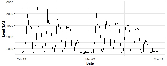
There is possible to see two main seasonalities in plotted time series: daily and weekly. We have 48 measurements during the day and 7 days during the week so that will be our independent variables to model response variable - electricity load. Let’s construct it:
N <- nrow(data_r) # number of observations in the train set
window <- N / period # number of days in the train set
matrix_gam <- data.table(Load = data_r[, value],
                         Daily = rep(1:period, window),
                         Weekly = data_r[, week_num])
Here we are! Train our first GAM with function gam. Independent variables are modeled by smoothing function s, for daily seasonality cubic regression spline is used, for weekly seasonality, P-splines is used, a number of knots are logically set to the number of unique values. Let’s do it.
gam_1 <- gam(Load ~ s(Daily, bs = "cr", k = period) +
               s(Weekly, bs = "ps", k = 7),
             data = matrix_gam,
             family = gaussian)
Package mgcv have many advantages and nice features. First is its visualization capabilities. Let’s try it:
layout(matrix(1:2, nrow = 1))
plot(gam_1, shade = TRUE)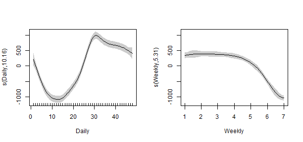
That looks nice, right? We can see here the influence of variables to electricity load. In the left plot, the peak of the load is around 3 p.m. during the day. In the right plot, we can see that during weekends the consumption logically decreases.
Let’s use summary function to do the diagnostic of our first model.
summary(gam_1)##
## Family: gaussian
## Link function: identity
##
## Formula:
## Load ~ s(Daily, bs = "cr", k = period) + s(Weekly, bs = "ps",
## k = 7)
##
## Parametric coefficients:
## Estimate Std. Error t value Pr(>|t|)
## (Intercept) 2731.67 18.88 144.7 <2e-16 ***
## ---
## Signif. codes: 0 '***' 0.001 '**' 0.01 '*' 0.05 '.' 0.1 ' ' 1
##
## Approximate significance of smooth terms:
## edf Ref.df F p-value
## s(Daily) 10.159 12.688 119.8 <2e-16 ***
## s(Weekly) 5.311 5.758 130.3 <2e-16 ***
## ---
## Signif. codes: 0 '***' 0.001 '**' 0.01 '*' 0.05 '.' 0.1 ' ' 1
##
## R-sq.(adj) = 0.772 Deviance explained = 77.7%
## GCV = 2.4554e+05 Scale est. = 2.3953e+05 n = 672What to look at here? EDF: estimated degrees of freedom - can be interpreted like how much given variable is smoothed (higher EDF value implies more complex splines). P-values: statistical significance of given variable to response variable, tested by F-test (lower is better). \( R^2 \) - adjusted R-squared (higher is better). GCV: GCV score (mentioned above). In the summary, we can see that the R-sq. (adj) value is a little bit low…
Let’s plot fitted values:
datas <- rbindlist(list(data_r[, .(value, date_time)],
                        data.table(value = gam_1$fitted.values,
                                   data_time = data_r[, date_time])))
datas[, type := c(rep("Real", nrow(data_r)), rep("Fitted", nrow(data_r)))]

ggplot(data = datas, aes(date_time, value, group = type, colour = type)) +
  geom_line(size = 0.8) +
  theme_bw() +
  labs(x = "Time", y = "Load (kW)",
       title = "Fit from GAM n.1")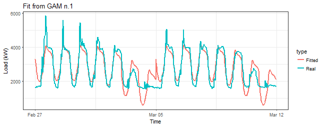
That is, of course, a horrible result. We need to include interactions of two independent variables to the model.
One more thing before that… What is hiding behind the stored gam_1 object and used optimizer?
gam_1$optimizer## [1] "magic"Here is that “magic”! ![]()
The first type of interactions will be the third one mentioned in the section about interactions, so one smoothing function to both variables is used. In the term s(Daily, Weekly) simple smoothing terms s(Daily) and s(Weekly) are also automatically included. Let’s do it.
gam_2 <- gam(Load ~ s(Daily, Weekly),
             data = matrix_gam,
             family = gaussian)

summary(gam_2)$r.sq
## [1] 0.9352108R-squared value suggests that result is much better. Look at the smooth term:
summary(gam_2)$s.table## edf Ref.df F p-value
## s(Daily,Weekly) 28.7008 28.99423 334.4754 0Seems good too, the p-value is 0, which means that independent variable is significant. Plot of fitted values:
datas <- rbindlist(list(data_r[, .(value, date_time)],
                        data.table(value = gam_2$fitted.values,
                                   data_time = data_r[, date_time])))
datas[, type := c(rep("Real", nrow(data_r)), rep("Fitted", nrow(data_r)))]

ggplot(data = datas, aes(date_time, value, group = type, colour = type)) +
  geom_line(size = 0.8) +
  theme_bw() +
  labs(x = "Time", y = "Load (kW)",
       title = "Fit from GAM n.2")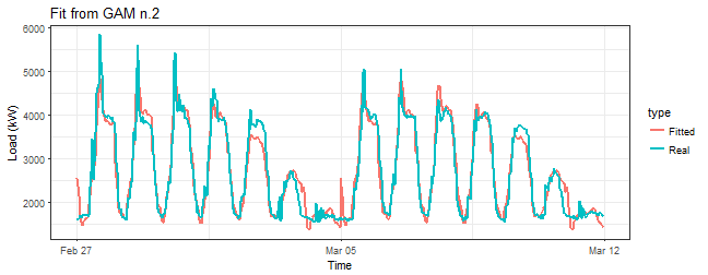
It’s not bad, but it can be better. Now, let’s try the above mentioned tensor product interactions. That can be done by function te, basis functions can be defined as well.
gam_3 <- gam(Load ~ te(Daily, Weekly,
                       bs = c("cr", "ps")),
             data = matrix_gam,
             family = gaussian)

summary(gam_3)$r.sq
## [1] 0.9268452Similar to the previous model gam_2. Look at the smooth term:
summary(gam_3)$s.table## edf Ref.df F p-value
## te(Daily,Weekly) 23.65709 23.98741 354.5856 0Again very similar results. Let’s look at fitted values:
datas <- rbindlist(list(data_r[, .(value, date_time)],
                        data.table(value = gam_3$fitted.values,
                                   data_time = data_r[, date_time])))
datas[, type := c(rep("Real", nrow(data_r)), rep("Fitted", nrow(data_r)))]

ggplot(data = datas, aes(date_time, value, group = type, colour = type)) +
  geom_line(size = 0.8) +
  theme_bw() +
  labs(x = "Time", y = "Load (kW)",
       title = "Fit from GAM n.3")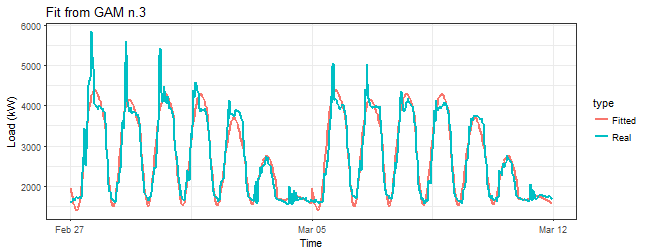
Just a little differences in comparison to the gam_2 model, looks like with te fit is more smoothed. Are we missing something? Of course! Function te has a default for a number of knots \( 5^d \), where d is a number of dimensions (variables), which is in our case too small. Now, I will set a number of knots to the maximal possible value k = c(period, 7), what means that upper boundary for EDF (Estimated Degrees of Freedom) will be 48*7 - 1 = 335.
gam_4 <- gam(Load ~ te(Daily, Weekly,
                        k = c(period, 7),
                        bs = c("cr", "ps")),
              data = matrix_gam,
              family = gaussian)

summary(gam_4)$r.sq
## [1] 0.9727604summary(gam_4)$sp.criterion## GCV.Cp
## 34839.46summary(gam_4)$s.table## edf Ref.df F p-value
## te(Daily,Weekly) 119.4117 149.6528 160.2065 0We can see here that R-squared jumped little bit up and edf value has increased five times (!) in comparison to the model gam_3.
Let’s plot fitted values:
datas <- rbindlist(list(data_r[, .(value, date_time)],
                        data.table(value = gam_4$fitted.values,
                                   data_time = data_r[, date_time])))
datas[, type := c(rep("Real", nrow(data_r)), rep("Fitted", nrow(data_r)))]

ggplot(data = datas, aes(date_time, value, group = type, colour = type)) +
  geom_line(size = 0.8) +
  theme_bw() +
  labs(x = "Time", y = "Load (kW)",
       title = "Fit from GAM n.4")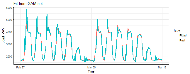
This seems much better than it was with model gam_3.
Now I will prove my statement about the upper boundary for EDF. There is a possibility to fix number of smooth basis (i.e. EDF) in smooth terms. Just use an argument fx = TRUE.
gam_4_fx <- gam(Load ~ te(Daily, Weekly,
                        k = c(period, 7),
                        bs = c("cr", "ps"),
                        fx = TRUE),
              data = matrix_gam,
              family = gaussian)

summary(gam_4_fx)$r.sq
## [1] 0.965618summary(gam_4_fx)$s.table## edf Ref.df F p-value
## te(Daily,Weekly) 335 335 57.25389 5.289648e-199EDF = 335, here we are. We can see that R-squared is lower than with the model gam_4, it is due to that 335 is too high and we overfitted the model. It is prove to that GCV procedure (estimation of lambda and EDF) is working properly. You can read more about the optimal setting (choosing) of k argument at ?choose.k and of course in the book from Simon Wood.
With the mgcv package we have two more opportunities, methods, how to include tensor product interactions term - with functions ti and t2. ti produces a tensor product interaction, appropriate when the main effects (and any lower interactions) are also present, while te produces a full tensor product smooth. t2 is an alternative function to te and uses different penalization method. You can read more about it in a documentation of the package mgcv: use ?ti and ?t2 to see more.
So, let’s try both methods in the our case (model). First, let’s use ti:
gam_5 <- gam(Load ~ s(Daily, bs = "cr", k = period) +
                    s(Weekly, bs = "ps", k = 7) +
                    ti(Daily, Weekly,
                       k = c(period, 7),
                       bs = c("cr", "ps")),
             data = matrix_gam,
             family = gaussian)

summary(gam_5)$r.sq
## [1] 0.9717469summary(gam_5)$sp.criterion## GCV.Cp
## 35772.35summary(gam_5)$s.table## edf Ref.df F p-value
## s(Daily) 22.583649 27.964970 444.19962 0
## s(Weekly) 5.914531 5.995934 1014.72482 0
## ti(Daily,Weekly) 85.310314 110.828814 41.22288 0Then let’s use t2. I set argument full = TRUE because it gives strict invariance to penalties.
gam_6 <- gam(Load ~ t2(Daily, Weekly,
                       k = c(period, 7),
                       bs = c("cr", "ps"),
                       full = TRUE),
             data = matrix_gam,
             family = gaussian)

summary(gam_6)$r.sq
## [1] 0.9738273summary(gam_6)$sp.criterion## GCV.Cp
## 32230.68summary(gam_6)$s.table## edf Ref.df F p-value
## t2(Daily,Weekly) 98.12005 120.2345 86.70754 0I have also printed the GCV score value for the last three models, which is also a good criterion to choose optimal model among a set of fitted models. We can see that with t2 term and corresponding model gam_6 the GCV value is the lowest. It may be indicating that gam_6 is our best model so far.
Other model selection criterion, which is widely used in statistics, is AIC (Akaike Information Criterion). Criterion has equation \( AIC = 2k - 2\ln (\hat{L}) \), where k is the number of parameters to be estimated and \(\hat{L}\) is the maximized value of the likelihood function of the model. So lower values are better for AIC. Let’s look at them for our three models:
AIC(gam_4, gam_5, gam_6)## df AIC
## gam_4 121.4117 8912.611
## gam_5 115.8085 8932.746
## gam_6 100.1200 8868.628The lowest value is in the gam_6 model, so again it’s the winning model. Let’s again look at fitted values to be sure that everything is OK.
datas <- rbindlist(list(data_r[, .(value, date_time)],
                        data.table(value = gam_6$fitted.values,
                                   data_time = data_r[, date_time])))
datas[, type := c(rep("Real", nrow(data_r)), rep("Fitted", nrow(data_r)))]

ggplot(data = datas, aes(date_time, value, group = type, colour = type)) +
  geom_line(size = 0.8) +
  theme_bw() +
  labs(x = "Time", y = "Load (kW)",
       title = "Fit from GAM n.6")
Seems OK. We can see that fitted values for models gam_4 and gam_6 are very similar. It’s very difficult to choose which model is better. It’s possible to use more visualization and model diagnostic capabilities of package mgcv to compare these two models.
The first one is function gam.check, which makes four plots: QQ-plot of residuals, linear predictor vs. residuals, the histogram of residuals and the plot of fitted values vs. response. Let’s make them for models gam_4 and gam_6.
gam.check(gam_4)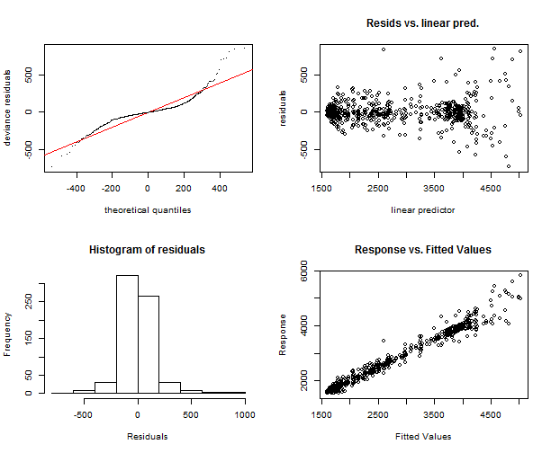
##
## Method: GCV   Optimizer: magic
## Smoothing parameter selection converged after 7 iterations.
## The RMS GCV score gradiant at convergence was 0.2833304 .
## The Hessian was positive definite.
## The estimated model rank was 336 (maximum possible: 336)
## Model rank =  336 / 336
##
## Basis dimension (k) checking results. Low p-value (k-index<1) may
## indicate that k is too low, especially if edf is close to k'.
##
##                      k'    edf k-index p-value
## te(Daily,Weekly) 335.00 119.41 1.22 1gam.check(gam_6)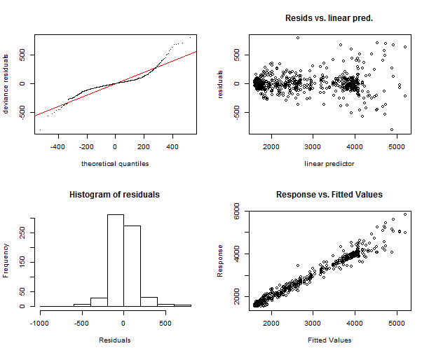
##
## Method: GCV   Optimizer: magic
## Smoothing parameter selection converged after 9 iterations.
## The RMS GCV score gradiant at convergence was 0.05208856 .
## The Hessian was positive definite.
## The estimated model rank was 336 (maximum possible: 336)
## Model rank =  336 / 336
##
## Basis dimension (k) checking results. Low p-value (k-index<1) may
## indicate that k is too low, especially if edf is close to k'.
##
##                      k'    edf k-index p-value
## t2(Daily,Weekly) 335.00  98.12    1.18       1
The function gam.check makes also output to the console of more useful information. We can see again that models are very similar, just in histograms some differences can be seen, but it’s also insignificant.
We didn’t use so far the default plot function to gam object for models with tensor product interactions. Let’s use it and explore what it brings us.
layout(matrix(1:2, nrow = 1))
plot(gam_4, rug = FALSE, se = FALSE, n2 = 80, main = "gam n.4 with te()")
plot(gam_6, rug = FALSE, se = FALSE, n2 = 80, main = "gam n.6 with t2()")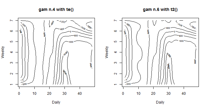
It’s a nice contour line plot. On axes are our independent variables, contour lines and corresponding numbers on them represents effects of ind. variables to the response variable. Now it is possible to see some little differences. The model gam_6 with t2 have more “wavy” contours. So it implies that it adapts more to response variable and smoothing factor is lower. In the next parts of the post, the model gam_6 will be used for the analysis.
Another great feature of the package mgcv is the plotting function vis.gam. It makes 3D view (or 2D) of surface of fitted values according to independent variables. Let’s look at it.
vis.gam(gam_6, n.grid = 50, theta = 35, phi = 32, zlab = "",
        ticktype = "detailed", color = "topo", main = "t2(D, W)")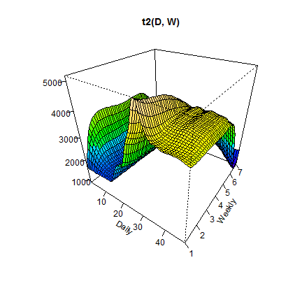
We can see that the highest peak is when the Daily variable has values near 30 (3 p.m.) and the Weekly variable has value 1 (it is a Monday).
2D view, contour lines type of plot, can be visualized too. Just set argument plot.type = "contour".
vis.gam(gam_6, main = "t2(D, W)", plot.type = "contour",
        color = "terrain", contour.col = "black", lwd = 2)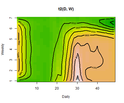
Again we can see that the highest value of electricity load is on Monday at 3:00 pm, it is very similar till Thursday, then the load is decreasing (weekends).
Another interesting contribution to the time series regression model can be an inclusion of autoregressive model for serially correlated errors. Let’s look at it.
Autoregressive models and GAMS
GAM or MLR have assumptions in a model that errors (residuals) are identically and independently distributed (i.i.d.). In the case of the time series regression, it is very strong assumption, which is here, logically, not fulfilled. Present time series values are highly correlated with past values, so errors of the model will be correlated too. This phenomenon is called an autocorrelation. This implies that estimated regression coefficients and residuals of a model might be negatively biased, which also implies that previously computed p-values of statistical tests or confidence intervals are wrong.
How can we handle this situation? By inclusion of autoregressive model (AR) for errors in our model. So we have the model with the term for errors like this:
\[y_i = \beta\mathbf{X} + \varepsilon_i, \hspace{0.2cm} \varepsilon_i = \phi\varepsilon_{i-1} + v_i,\]where the second equation is a classical AR(1) process and \( \phi \) is an unknown autoregressive coefficient to be estimated. Errors can be also nested within a week, which is in our case more appropriate, because of the double seasonal character of our time series. You can add also higher orders of AR process and also MA (moving average) model. You can read more about estimation and modeling of this kind of models in an excellent book by Box, Jenkins, and Reinsel: Time Series Analysis.
It’s possible to add correlation term for errors with function gamm, which stands for GAM mixture models. It calls the lme function from package nlme. Now, train basic model with function gamm and an another model with AR(1) process nested within a week - just add this argument to gamm function: correlation = corARMA(form = ~ 1|Weekly, p = 1).
gam_6_ar0 <- gamm(Load ~ t2(Daily, Weekly,
                            k = c(period, 7),
                            bs = c("cr", "ps"),
                            full = TRUE),
                  data = matrix_gam,
                  family = gaussian,
                  method = "REML")

gam_6_ar1 <- gamm(Load ~ t2(Daily, Weekly,
                            k = c(period, 7),
                            bs = c("cr", "ps"),
                            full = TRUE),
             data = matrix_gam,
             family = gaussian,
             correlation = corARMA(form = ~ 1|Weekly, p = 1),
             method = "REML")
We can use an ANOVA to compare these two models and pick the right one. It does generalized likelihood ratio test to our nested models.
anova(gam_6_ar0$lme, gam_6_ar1$lme)## Model df AIC BIC logLik Test L.Ratio p-value
## gam_6_ar0$lme 1 10 9070.525 9115.568 -4525.263
## gam_6_ar1$lme 2 11 8751.361 8800.908 -4364.680 1 vs 2 321.1644 <.0001AIC value of the model with AR(1) term is lower, so it seems better, also p-value is very low which indicates that second model is better to choose.
Estimated \( \phi \) coefficient of AR(1) process can be seen here:
intervals(gam_6_ar1$lme, which = "var-cov")$corStruct## lower est. upper
## Phi 0.6363101 0.7107914 0.7721434
## attr(,"label")
## [1] "Correlation structure:"Value 0.71 is pretty high, which indicates a strong dependency on previous values of errors (lags).
Now let’s look another diagnostic for these two models. Plot of values of a partial autocorrelation function applied to normalized residuals. It gives the partial correlation of residuals with its own lagged values, controlling for the values of the residuals at all shorter lags.
layout(matrix(1:2, ncol = 2))
pacf(resid(gam_6_ar0$lme, type = "normalized"), lag.max = 48, main = "pACF of gam n.6")
pacf(resid(gam_6_ar1$lme, type = "normalized"), lag.max = 48, main = "pACF of gam n.6 with AR(1)")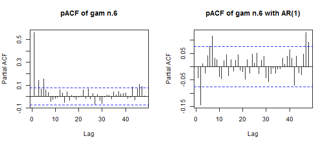
We can see a significant difference between these two plots and corresponding values of pACF. Optimal values of pACF should be under dashed blue lines, which isn’t completely this scenario on the right plot (model with the AR(1)). It can be better…
I will do little hack now. For optimal choose of AR(p) and MA(q) orders auto.arima function, from the library forecast, will be used on residuals from the model gam_6_ar0. It automatically chooses optimal orders of ARMA (in our case) based on AIC criterion. As we can use just ARMA models in gamm, so nonstationarity isn’t allowed, set an argument stationary = TRUE.
library(forecast)
arma_res <- auto.arima(resid(gam_6_ar0$lme, type = "normalized"),
                       stationary = TRUE, seasonal = FALSE)

arma_res$coef
## ar1 ma1 ma2
## 0.9102517 -0.3763428 -0.2862549It’s interesting. auto.arima chooses also two orders of MA model. Let’s fit a new model and again do ANOVA.
gam_6_arma<- gamm(Load ~ t2(Daily, Weekly,
                            k = c(period, 7),
                            bs = c("cr", "ps"),
                            full = TRUE),
                  data = matrix_gam,
                  family = gaussian,
                  correlation = corARMA(form = ~ 1|Weekly, p = 1, q = 2),
                  method = "REML")

anova(gam_6_ar0$lme, gam_6_ar1$lme, gam_6_arma$lme)
## Model df AIC BIC logLik Test L.Ratio
## gam_6_ar0$lme 1 10 9070.525 9115.568 -4525.263
## gam_6_ar1$lme 2 11 8751.361 8800.908 -4364.680 1 vs 2 321.1644
## gam_6_arma$lme 3 13 8731.750 8790.306 -4352.875 2 vs 3 23.6107
## p-value
## gam_6_ar0$lme
## gam_6_ar1$lme <.0001
## gam_6_arma$lme <.0001The new model gam_6_arma is slightly better in the meaning of AIC. P-value is again very small, which means that gam_6_arma is significantly better than gam_6_ar1.
Now do a comparison of these two models on theirs pACF values.
layout(matrix(1:2, ncol = 2))
pacf(resid(gam_6_ar1$lme, type = "normalized"), lag.max = 48, main = "pACF of gam n.6 with AR(1)")
pacf(resid(gam_6_arma$lme, type = "normalized"), lag.max = 48, main = "pACF of gam n.6 with ARMA(1,2)")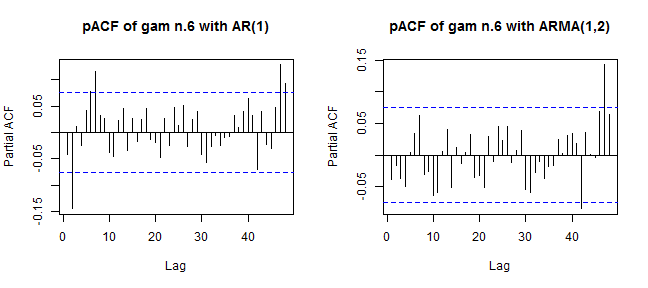
It’s better now. Can we be happy? Up to now, everything seems fine.
Let’s make one more visualization of residuals of two models to confirm our little uncertainty about the correctness of the model with ARMA(1,2). Compare it with baseline model gam_6_ar0.
datas <- data.table(Fitted_values = c(gam_6_ar0$gam$fitted.values,
                                      gam_6_arma$gam$fitted.values),
                    Residuals = c(gam_6_ar0$gam$residuals,
                                  gam_6_arma$gam$residuals),
                    Model = rep(c("Gam n.6", "Gam n.6 with ARMA(1,2)"), each = nrow(data_r)))

ggplot(data = datas,
       aes(Fitted_values, Residuals)) +
  facet_grid(Model~., switch = "y") +
  geom_point(size = 1.7) +
  geom_smooth(method = "loess") +
  geom_hline(yintercept = 0, color = "red", size = 1) +
  theme(panel.border = element_rect(fill = NA, color = "black"),
        plot.title = element_text(size = 14, hjust = 0.5, face = "bold"),
        axis.text = element_text(size = 11),
        axis.title = element_text(size = 12, face = "bold"),
        strip.text = element_text(size = 13, face = "bold"),
        strip.background = element_rect(color = "black")) +
  labs(title = "Fitted values vs Residuals of two models")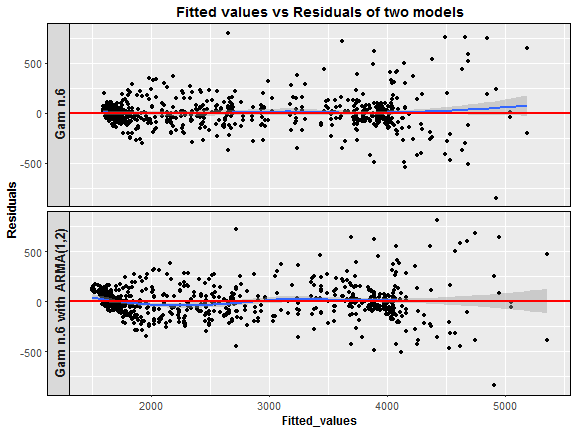
Here we are. The model with an ARMA(1,2) process has residuals at low fitted values somehow correlated, which is not good (heteroscedasticity). What now? I have to be honest, I can’t explain why this interesting thing happened. So, I would be very happy when someone guides me to the right direction and writes some notes to the discussion, it would really help. One more note about the inclusion of ARMA models to GAM or MLR. It didn’t help in the meaning of forecast accuracy, I made a lot of experiments, but MAPE was higher than with models without ARMAs. The big disadvantage is also higher time complexity than with the simple model without ARMA.
Animations and conclusions
I will end this post with a visualization analysis of the model gam_6. I will try to do some animated dashboards of main characteristics of the model thru time. It should be very interesting how electricity load changes and how the model can adapt to these changes. In the first two animations you can see three plots on the one figure:
- Fitted values by GAM and real response values of electricity consumption.
- Fitted values vs. residuals of GAM.
- Forecast for one week ahead vs. real consumption plus forecast accuracy in MAPE.
Animations were created by functions from package grid to layout ggplots to one figure, and function saveGIF from package animation to create the final GIF. Here there are:
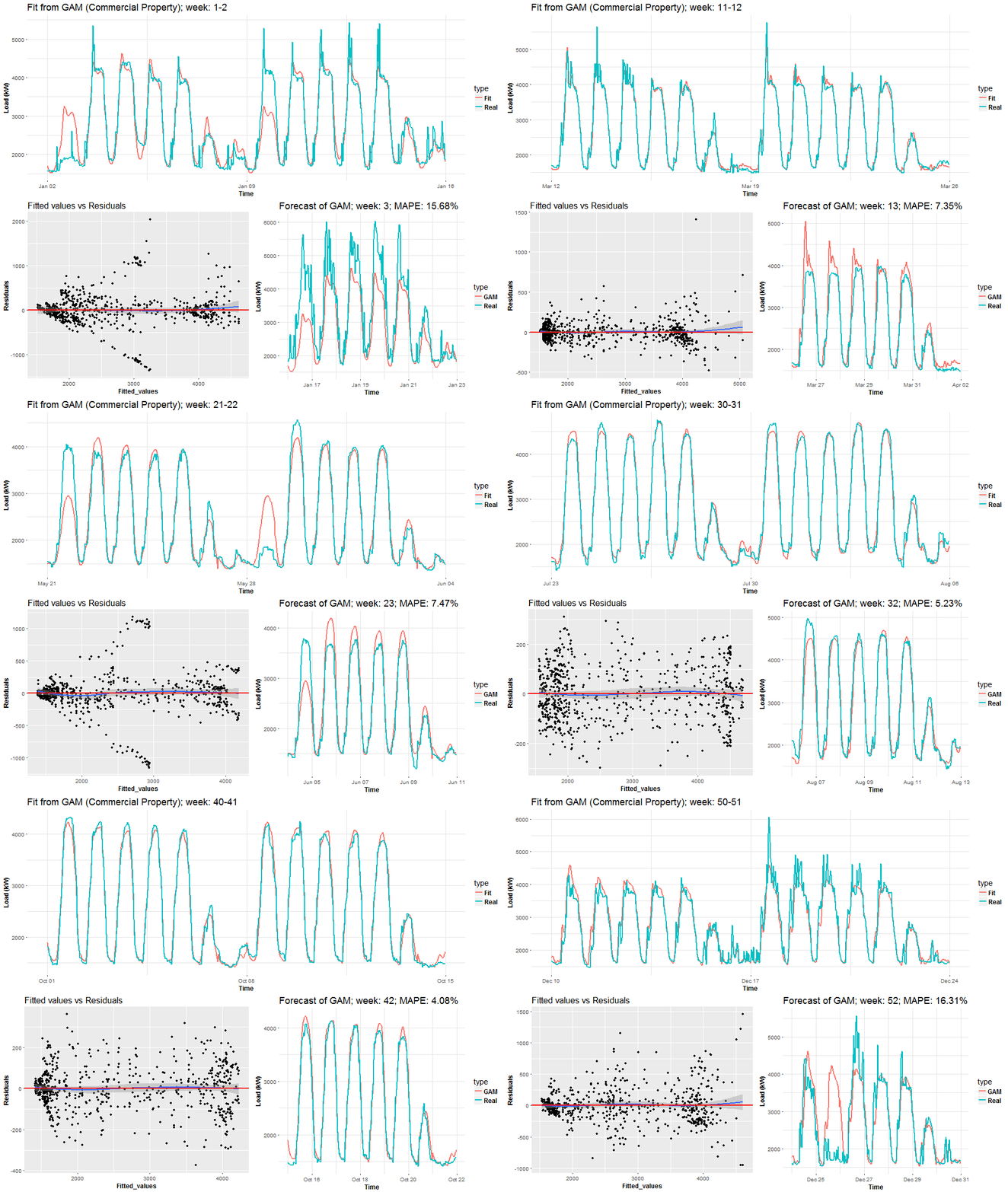
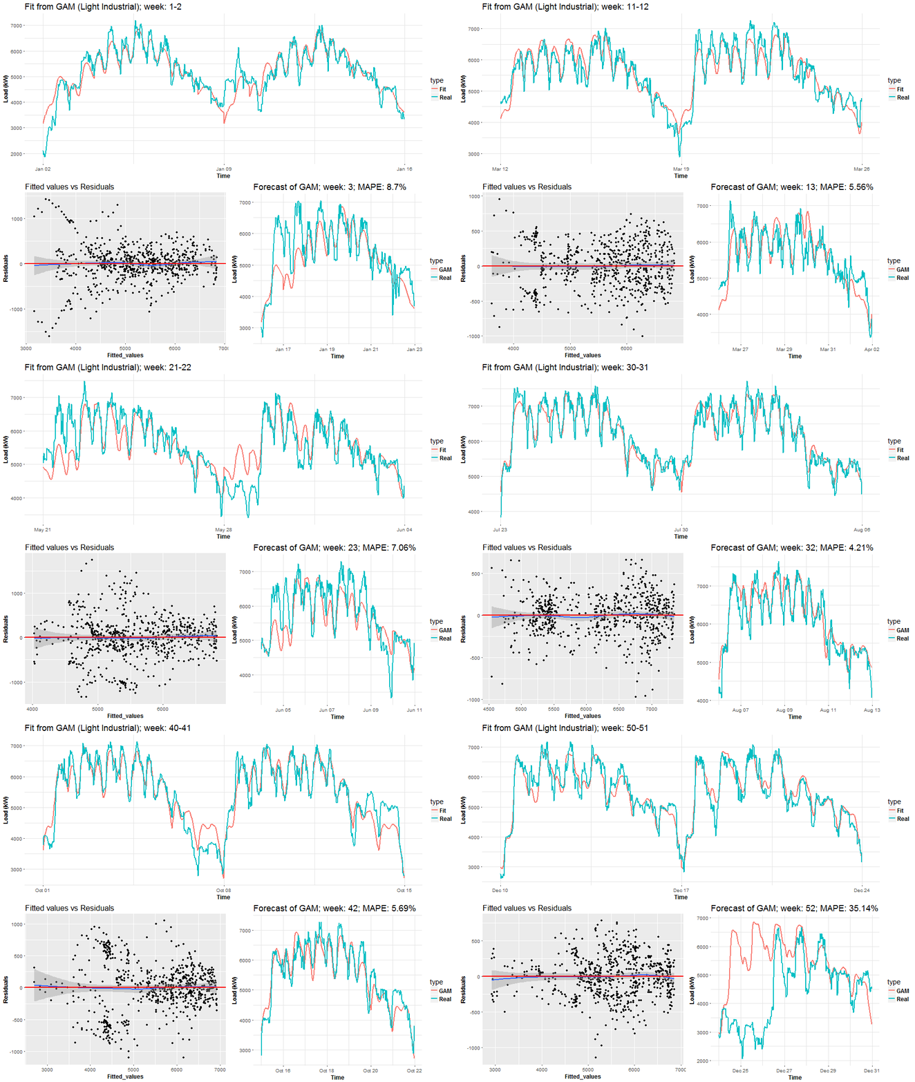
We can see the behavior of GAMs on two times series from two different types of industries: commercial property and light industrial. Notice (look), that fitted values and forecasts are smoother than where were with Multiple linear regression from the previous post. It’s good information to know, it implies that our model isn’t overfitted. On the other hand, I also compared forecast performance of GAM and MLR, but GAM was slightly worse than MLR, which can be a little bit surprising for somebody. Seems that usage of penalized least squares (GAM) for forecasting time series doesn’t bring improvement against classical OLS (MLR). But there are other advantages, which I will point out in the end.
Another animation, which I created, is a 3D visualization of fitted values like a surface. As I showed you before, it can be done very easily by function vis.gam.
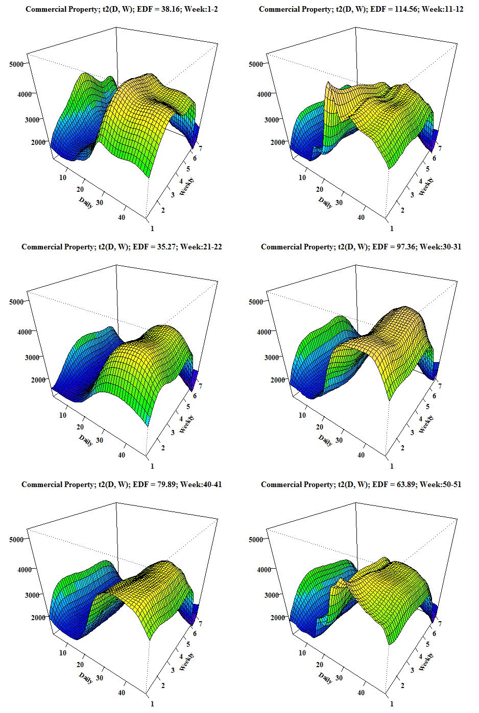
We can compare it with the first dashboard because again it’s time series from commercial properties. EDF is also printed to the title of GIF for reasons to see how it changes depending on the behavior of electricity consumption.
With this, I would like to end the main part of this tutorial and conclude it with some remarks.
In the beginning of the post, motivation and the theory behind GAM method was introduced. Next, the analytical (“magical”) part continued with explaining various features of the package mgcv. Different types of interactions were showed and analyzed - best chose was tensor product interactions (t2). Next, consideration about the correctness of an autoregressive model (or ARMA) for errors was discussed - ended with an open question. In the end, I tried to make a big view of a behavior of GAMs by animations of its performance on double seasonal time series.
Everything that was said implies these advantages and disadvantages of using GAM for your problem:
Advantages:
- Many possibilities how to model your independent variables (many types of smooth functions).
- Model response variable by all known distribution families (Normal, Gamma, Poisson etc.).
- Define interactions by tensor product, which means usage of different basis functions for interacted variables.
- Test statistical significance of a non-linear relationship of the independent variable to dependent.
Disadvantages:
- Complex method, difficult to learn.
- It’s sometimes difficult to interpret results.
- Several parameters to tune, which have to be set carefully.
In the future post, I want to focus on some machine learning method like Support Vector Regression or Regression Trees with alongside of grid search for tuning parameters.
The script (3post-GAM.R) for a creation of the whole tutorial is located on my GitHub repository. I would like to encourage you to add any feedback to the discussion below. Thank you for reading this long post.
Seven coffees were consumed while writing this article.
If you’ve found it valuable, please consider supporting my work and...
